What the Heck Is Junk Journaling?

If you’re like me and follow a lot of crafting sites, you may have noticed something called “junk journaling” popping up in your feed. While it’s not exactly a new trend, it seems to have become more popular over the years. What I was seeing really intrigued me and pushed me to learn more about it.

I’m still at the beginning of my junk journaling journey, but I decided it was time to give it a try! Before I share my first attempt, I want to tell you a little about what I’ve discovered and, more importantly, my personal take on it.


What Is Junk Journaling?

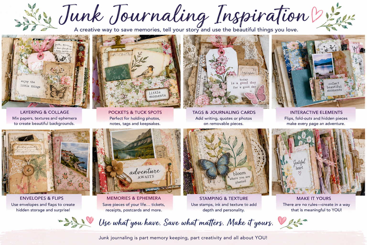
From what I’ve seen, junk journaling is a form of memory keeping that is a little less structured and a lot more free-form and personal.

That’s not to say traditional memory keeping isn’t personal—of course it is! What I mean is that junk journaling seems to focus even more on giving the creator a place to express themselves rather than preserving memories specifically for others to enjoy later.

To me, junk journaling feels like a combination of scrapbooking, journaling, collage and personal creative expression.

And one of the things I love most about it? There really doesn’t seem to be a “right” way to do it!

So Why Try It?

Think of it as a creative outlet where you’re allowed to be messy, use up your scraps, embrace imperfection and tell your story your way.

It can still be a form of memory keeping, but instead of focusing primarily on what happened, as we often do in traditional scrapbooking, it can focus more on how you felt, what you noticed and what the experience meant to you.

You might include little bits and pieces that would normally be discarded—a receipt, ticket stub, packaging, a handwritten note or even that photo that isn’t quite “perfect” enough for your scrapbook page.

Sometimes it may simply be a collage of colors, words, textures and items that mean something only to the person creating it.

While junk journals can still be beautiful and fun to share, they can also be incredibly personal. Much like a traditional written journal, they give the creator an opportunity to express themselves—but with both words and pictures.

What Else Is Different?

The things that go into a junk journal are only part of what makes it different. Another fun aspect is the opportunity to make the journal itself an experience, rather than simply flipping through pages in a book.

We’re actually seeing more of this in traditional scrapbooking too, and Stampin’ Up!’s Flip Flaps are a perfect accessory for this type of memory keeping.

Junk journals are often filled with pockets, tags, hidden journaling, fold-outs and other interactive elements. There can be lots of layers, textures and dimension, creating thick pages and chunky books that don’t necessarily follow traditional scrapbook formats.

I also noticed that some junk journals have a very specific focus—a trip, holiday or special season of life—while others are much more open-ended. You might find journals filled with favorite quotes, gratitude, everyday moments, creative experiments or simply whatever inspired the creator that day.

Size and Structure – One of the other differences I noticed is that most junk journals are much smaller than traditional 12″ x 12″ or even 8½” x 11″ scrapbooks. They tend to be closer to the size of a notebook or journal you might purchase. The journal itself can take many forms, too. Some are made from purchased journals or old books, while others are handmade from individual pages held together with ribbon, binder rings, stitching, or other creative methods. One thing you’ll quickly discover with junk journaling is that there really isn’t a specific mold or “right” way to create one. The size, structure, pages, and binding can be as unique as the person creating it.

That freedom is part of what intrigues me!


So, What’s Next?

As I’ve searched for more information, I’ve found myself thinking about how I can incorporate some of these ideas into what I’m already creating.

There are elements of junk journaling that fit beautifully with scrapbook pages, fun fold cards and especially mini albums—which already include many of the same interactive characteristics.

I’m looking forward to learning some of these techniques and experimenting with how they can transfer back and forth between different types of paper crafting, while still maintaining my own personal crafting style.

I hope you’ll enjoy exploring right along with me!


Want to See My First Try?

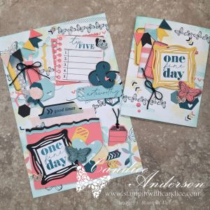
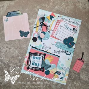
During my live, I created my first junk journaling project from scratch, so you can follow along as I experiment with the process and discover what works for me.

I chose to work with Beautiful Ordinary Life and the Extraordinary Life Bundle because I felt many of their elements fit naturally with junk journaling while still allowing me to give it a more modern twist.

In fact, I think the Extraordinary Life Scrapbooking Workshop Kit could be really fun to transform into a junk journal. That may have to be another experiment!

Starting Small

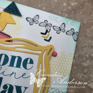
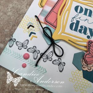
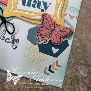
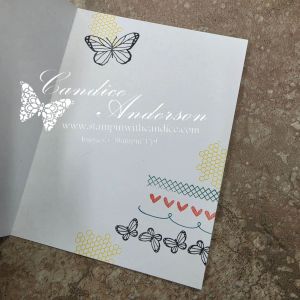
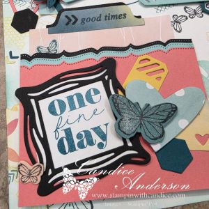
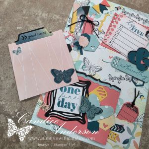
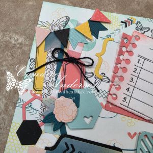
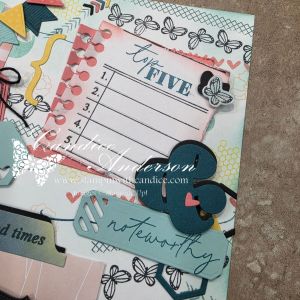
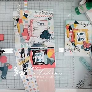
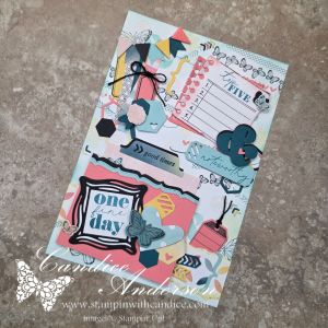
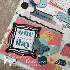
Before jumping into my journal, I decided to practice some of the techniques on a card first. The card features many of the carefree, layered elements that I incorporated into the junk journal cover I created during my live. This gave me an opportunity to try some of the ideas on a smaller scale before moving on to a larger page with even more elements.
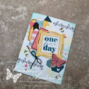
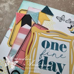
As I worked through the creative process, I discovered a few things I wanted to share.

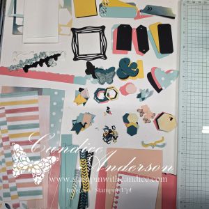
Give Yourself Plenty to Work With

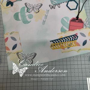
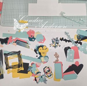
Because this was completely new to me, and I chose to work primarily with one suite rather than combining lots of different products, I started by cutting and stamping a variety of random pieces using the dies and stamps from the suite and bundle.

This gave me a collection of elements to pull from as I started creating both my card and my journal cover. Instead of stopping every few minutes to stamp or cut another piece, I could simply play with what I had and see how the different elements worked together.
Don’t Be Afraid of a Busy Background

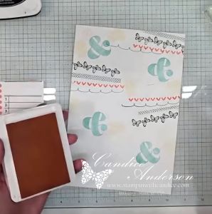
Another thing I noticed while watching junk journaling videos was how often the creators started with a fairly busy patterned background. Sometimes they used patterned paper, while other times they created their own background with random stamping.

For my project, I chose to focus on random stamping because there are so many great images in the suite and bundle that worked perfectly for this.

Rather than worrying about creating a perfectly balanced stamped background, I could simply add images here and there knowing that much of it would eventually be covered by additional layers.

Add Some Blending

I also noticed blending brushes being used quite a bit. Blending ink around the edges can help create that worn, weathered or vintage look you often see in traditional junk journals.

Even though I was going for a more modern look, I really liked what the blending added to my project. It softened some of the pieces, added depth and helped all of those different layers work together.

Embrace a Little Creative Chaos

One thing I commented on several times during my live was that the process felt a little chaotic—but not in a bad way. It was actually kind of freeing!

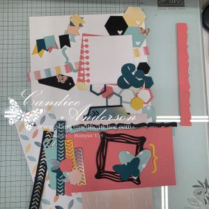
Once I had my background created, I started laying pieces down and moving them around to see what worked together. Instead of following a specific layout or worrying about exact placement, it became more about getting a feeling for what looked right and what allowed me to express myself.

Interestingly, I went through this process once before the live and then again during the live. Since I chose not to glue everything down during the video to save time, I had to recreate the layout afterward—and the final journal cover ended up a little different again!

I think that’s part of the fun. There doesn’t have to be one exact finished design you’re trying to reproduce.
Add Pockets & Little Surprises

One other element I really wanted to focus on was incorporating some of the pockets, tags and elements of surprise that I had seen in other junk journals.

I shared my basic plan during the live, but I didn’t completely finalize how everything would work until afterward.

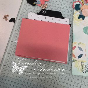
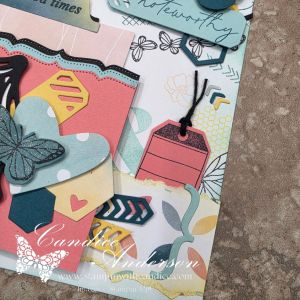
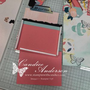
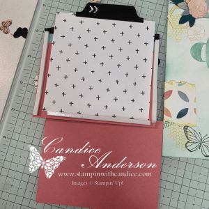
Because I ended up placing torn elements behind the area where my main pocket was going, I used foam adhesive strips along with an additional piece of paper to fully turn it into a functional pocket before attaching it to the page.

I also attached some of my torn paper pieces only along the sides and bottom, which created another little hidden pocket for one of my tags.

Those small changes gave me additional interactive elements while adding even more dimension to the project.
So…What Did I Think?

I honestly had more fun creating this than I thought I would, and I can definitely see the appeal of junk journaling now.

It’s still outside my comfort zone, but I think that’s part of what made it so much fun. It gave me permission to create differently—to layer more, worry less about perfect placement and simply see where the project took me.

I’m looking forward to exploring junk journaling more and seeing how some of these ideas can transfer across the other forms of crafting I already love.
And I’m not stopping there!

Be watching for this month’s Scrapped! episode, where I’ll turn the experiment around and explore how I can take some of these same junk journaling ideas and bring them back into traditional scrapbooking.

I have a feeling the lines between cardmaking, scrapbooking and junk journaling might not be quite as defined as I once thought!


Create It Your Way

Whether you choose traditional scrapbooking, mini albums, junk journaling, card making—or a little bit of everything—the important thing is finding a creative style that speaks to you.

There’s room to preserve the big memories, document the everyday moments, save those little pieces of life that might otherwise get thrown away and simply create because creating makes you happy.

No matter how you choose to preserve your thoughts and memories or let your creativity shine, I hope what I share inspires you to sit down, create and feel the joy it brings.

And since I’m learning too, I’d love to hear from you! Have you tried junk journaling? What do you love about it? Or, if you’re new to it like me, what would you like to learn?


No matter where your creative journey takes you, I’m so glad you’re here. Let’s learn, create, connect, and grow together—one project at a time. 🦋

A beautifully crafted Christmas card featuring a window scene that displays a peaceful nativity setting on one side, while the inside is adorned with cozy holiday elements like hanging stockings and warm colors.

💕 Let’s Stay Connected

📺 YouTube 📘 Facebook 📸 Instagram 📌 Pinterest

From Treat Bag to Box: My Favorite Heart Gusseted Treat Bag Project

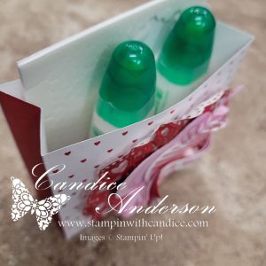
Monday night on my live, I shared multiple projects using the Heart Gusseted Treat Bags (#167073), and I had so much fun playing with these bags and seeing just how many ideas I could come up with. 💕

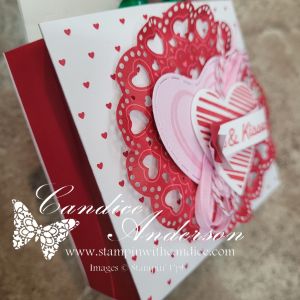
My live video featured my favorite project.. This little box is relatively simple to make, and I love how versatile it is—plus, one bag makes TWO boxes, which is always a win!

Box Instructions

Start with one Heart Gusseted Treat Bag:

  1. Cut off the top folded portion of the bag.
    • Measure 9-1/4″ up from the bottom and cut.
  2. Trim the bottom so the bag measures 9″ total.
  3. Cut the bag in half at 4-1/2″.
  4. Score the bottom at 3/4″.
    • Be sure to flip the piece so you get a good score on both sides.
  5. Cut the corners on the bottom of each piece up to the 3/4″ score line.
    • You should now have two red sections and two white sections.

Box Base (for Support)

  • Cut a piece of chipboard to 4″ x 1-1/4″
    • I used chipboard from my Paper Pumpkin kits.
  • Cover with Real Red cardstock, also 4″ x 1-1/4″.
  • Adhere to the bottom of the inside of the box for extra stability.

Decorating Details

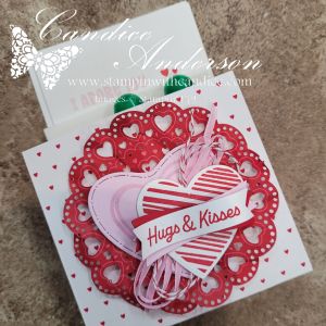
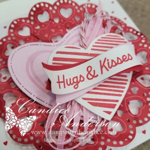
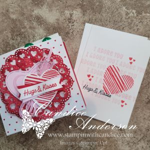
A close-up view of a decorative Valentine's Day card featuring layered hearts in shades of pink and red, with a ribbon that reads 'Hugs & Kisses'. The background includes a lace-like doily pattern.

Decorate your box as desired! For my sample, I used:

  • Lovely Doilies #167104
  • Endless Love Stamp Set #167055
  • Endless Love Dies #167061
  • Bubble Bath Ribbon #167075
  • Real Red Baker’s Twine #164051

Colors: Real Red, White, & Bubble Bath

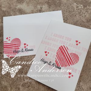
Perfect Fit: This box fits our Note Cards (#159232) perfectly, making it ideal for a sweet Valentine note or gift enclosure.

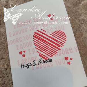
The simple card design tucked inside the box was inspired by Heidi Collins, keeping the look clean, classic, and easy to recreate.

Bonus: This project is the perfect fit for this week’s Global Design Project challenge – Hearts #GDP531! 💖

Be sure to check out my video to see just how easy this project is to create, along with the other fun ideas I shared. I’ll be posting more details on the remaining projects later this week, so be sure to tune back in! 💕


A beautifully crafted Christmas card featuring a window scene that displays a peaceful nativity setting on one side, while the inside is adorned with cozy holiday elements like hanging stockings and warm colors.

Please feel free to contact me if you have any questions.

Contact me today to place your order!
435-232-2655 Cell ( Call or Text)
andersoncandice@hotmail.com


💕 Let’s Stay Connected

📺 YouTube
📘 Facebook
📸 Instagram
📌 Pinterest

Create Unique Backgrounds with Nature’s Symphony Techniques

This week the Global Design Project featured another color challenge using Night of Navy, Azure Afternoon, and Balmy Blue. I briefly considered using December’s Product of the Month since those blues would have worked perfectly, but in the end I decided to do something a little different and create my own background paper.

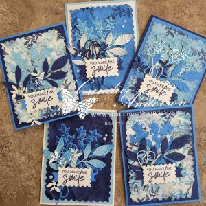
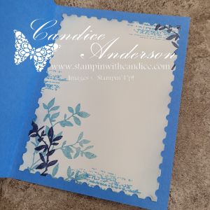
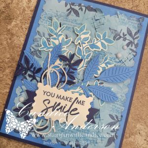
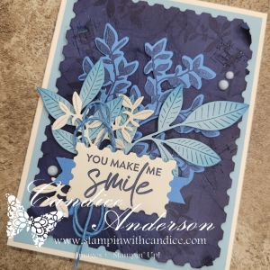
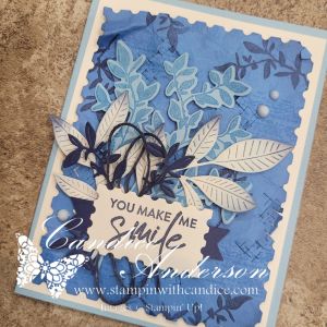
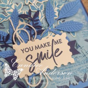
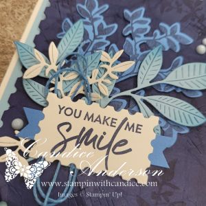
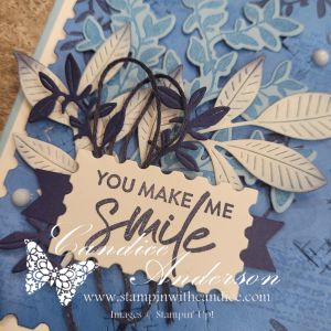
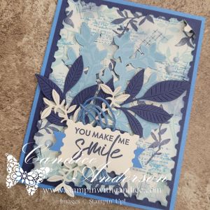
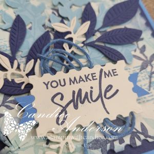
I pulled out the Nature’s Symphony Stamp Set (#166919) and Dies (#166925) and had so much fun experimenting that I ended up mixing and matching the technique with several different background colors. Each one turned out completely unique. Can you guess which one was my original? I’ll give you a hint—it started with Very Vanilla cardstock, which I really love because it highlights the technique.

Creating the Textured Background

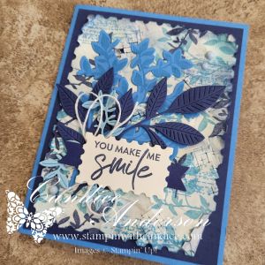
I originally planned to stamp the image and let it peek through the die-cut opening, but once I started playing, I realized I wanted even more texture. Instead, I layered stamped and die-cut elements to really build depth.

To make your own background, start with a piece of Very Vanilla cardstock cut with the second-largest die from the Perennial Postage set (#162607).

  • Stamp the large leaf image randomly in Balmy Blue
  • Add the textured line image in Azure Afternoon
  • Finish by stamping the small leaf in Night of Navy

Now for the fun (and slightly scary) part—crumple the paper. Yes, really! Squish it up to create a rough, worn texture full of dimension. Once flattened out a bit, use Blending Brushes (#160518) with Balmy Blue and Night of Navy to add even more depth.

Adding Extra Texture

In the Nature’s Symphony die set, there’s a small die made up of hash marks. It doesn’t cut out an image—it cuts tiny hash marks creating textures instead. Run this die across your background in multiple directions. After sending it through the Cut & Emboss Machine, the paper will be flatter again, so go ahead and crumple it one more time. Be gentle—those cut areas can catch—but allow some sections to bend and open for even more interest. Add a little extra ink with your blending brushes to highlight those textured areas.

Finishing the Cards

Once the background was complete, all that was left was deciding what colors to stamp and die-cut for the remaining elements. I used the same technique on multiple cardstock colors, but Very Vanilla really lets all the details shine.

I finished each card by layering the die-cut elements, using Dimensionals behind the delicate leaf piece for added depth. A quick tip: if you cut the cardstock layer that sits behind your postage die piece to the correct size, you can die-cut one of the leaf shapes from the center first, saving cardstock before adhering it.

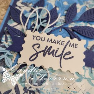
For the greeting, I used the second-smallest rectangle postage die, added small piece of paper that I used the Three Banner Punch #167050 to turn into a tach and finished with Very Vanilla Baker’s Twine behind it. Did you notice on some of the cards it isn’t very vanilla? I customized the twine color by brushing ink directly onto it with a blending brush—a great trick when you need ribbon in just the right shade. I always keep white or vanilla twine on hand for this reason. To finish things off, I added a touch of bling with Muted Palette Dots (#165155).

Final Result

In the end, I created five stunning cards, all using the same basic technique but each with its own unique look and feel. It may sound complicated, but it’s actually pretty easy once you try it—and I even made a hyper-speed video so you can see the whole process in action.

Which one do you think was my original? 💙


A beautifully crafted Christmas card featuring a window scene that displays a peaceful nativity setting on one side, while the inside is adorned with cozy holiday elements like hanging stockings and warm colors.

Please feel free to contact me if you have any questions.

Contact me today to place your order!
435-232-2655 Cell ( Call or Text)
andersoncandice@hotmail.com


💕 Let’s Stay Connected

📺 YouTube
📘 Facebook
📸 Instagram
📌 Pinterest

Easy Fun Fold Gift Card Holder Tutorial

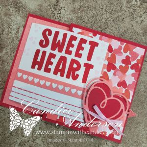
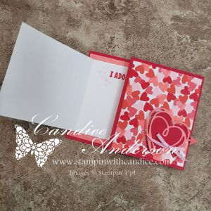
On my Monday Live, I shared an easy-to-make fun fold gift card holder inspired by my recent mini album. This sweet project features brand-new products that were released just yesterday, and I absolutely love how simple yet impressive this design is.

Card Base & Structure

Start with a piece of Real Red cardstock cut to 4-1/4″ x 11″.
Score at 5-1/2″ and 9″.

  • The 5-1/2″ section will be on the left side of the card.
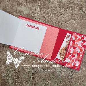
  • Fold the 2″ section inward, then fold again on the 5-1/2″ score line.
  • This creates a pocket on the inside of the card.

Secure the sides of the pocket using Tear & Tape (#154031), leaving the top edge open so you can tuck in a gift card or cash.

Inside Panel

Cut Flirty Flamingo cardstock to 5-1/4″ x 4″ and emboss it using the
Hearts of Love 3D Embossing Folder (#167071).

Attach this to the inside of the card on the 5-1/2″ x 4-1/4″ section.

Designer Series Paper

From the Made with Love Designer Series Paper (#167054), cut:

  • 4″ x 3-1/4″
  • 4″ x 1-3/4″

Place these pieces on:

  • The 3-1/2″ section folded to the front
  • The 2″ section folded inside to form the pocket

Left Folding Panel

Cut Basic White cardstock to 3-1/2″ x 7″ and score in half at 3-1/2″.

Stamp “Sweet Heart” from the Love Story Stamp Set (#167065) on the front and decorate as desired.

Attach this panel centered over the embossed section on the left side of the card base.

For one version, I placed the mini hearts directly on the white panel. For the second card, I added them to a 1/4″ strip of coordinating paper for a slightly different look.

Closure & Finishing Touches

For the closure, cut:

  • One solid heart
  • One lined heart

Using the Endless Love Dies (#167061).
Add arrows if you’d like for extra detail.

Attach the hearts to the front using Stampin’ Dimensionals, creating a small pocket for the folded panel to tuck underneath.

Finish the card with Bubble Bath Faux Linen Ribbon (#167075).


I love how simple and easy this fun fold gift card holder is to make, yet it has such a wow factor. Be sure to check out the video to see the step-by-step process, and I can’t wait to see your ideas using this design and these beautiful new products!


A beautifully crafted Christmas card featuring a window scene that displays a peaceful nativity setting on one side, while the inside is adorned with cozy holiday elements like hanging stockings and warm colors.

Please feel free to contact me if you have any questions.

Contact me today to place your order!
435-232-2655 Cell ( Call or Text)
andersoncandice@hotmail.com


💕 Let’s Stay Connected

📺 YouTube
📘 Facebook
📸 Instagram
📌 Pinterest

Finding Inspiration Through Casing a Designer | #GDP528

Casing Inspiration: Three Unique Card Designs

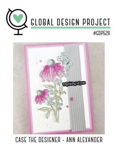
A card design featuring pink flowers and blue accents, with a stamped greeting saying 'Thinking of you,' framed by a gray vertical panel, and a pink border.

I don’t know about you, but inspiration is often one of the hardest parts of creating. Looking at what you have and figuring out how to turn it into something that not only speaks to you—but to others as well—can feel overwhelming at times. That’s where casing comes into play.

Casing (Copy And Share Everything) is one of my favorite ways to spark creativity. I often look to other designers when I need a jump-start, and the Global Design Project – Case the Designer challenges are a perfect source of inspiration.

This week we cased designer Ann Alexander, and during my live I shared how I pulled different elements from her card to inspire three very different designs of my own.


Card One – Same Layout, New Look

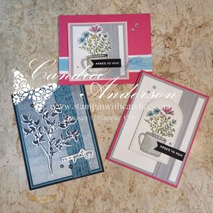
A handmade card featuring a botanical illustration of leaves in white on a textured blue background, with a greeting that says 'to a great guy'.

For my first card, I stayed fairly true to the original layout, but changed things up by using very different colors and imagery. I started with one of the new suites coming in January, Nature Walk (#166936), and used several elements from the suite including the stamp set, dies, Designer Series Paper, and embellishments.

To keep this card simple, I let the DSP do most of the work and added a stamped leaf image in Secret Sea along with a simple greeting. This is a great example of how keeping the layout but changing the products can completely transform a design.


Card Two – Color Combo with a Twist

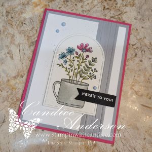
Card featuring a floral arrangement in a cup with a greeting that says 'HERE'S TO YOU!', set against a layered background of gray and pink.

For my second card, I wanted to focus more on the color inspiration while still using the basic design—this time with a bit of a twist. Because the floral image in Weekend Adventures (#167318) isn’t a large focal image like the cased card, I chose to frame it using the Everyday Arches Dies (#164629).

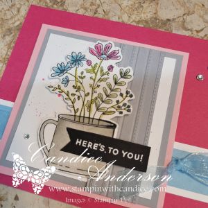
I stamped the image on Watercolor Paper (#149612) and colored it using Water Painters (#168253) with ink pads for a soft, blended look. The greeting was heat-embossed in white on black cardstock and punched out using the Banner Sayings Bundle (#167051).

To add texture, I used the Lovely Stripes 3D Embossing Folder (#167179 – coming in January) and kept the color palette clean and bold with Melon Mambo and Smoky Slate cardstock. I finished the card with Muted Palette Dots (#165155) for a subtle pop of detail.


Card Three – Smaller Scale, Same Inspiration

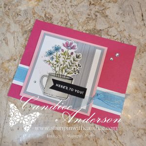
My final card is the one I demonstrated during the live. I kept the same core color palette from card two, but added Balmy Blue and Pretty in Pink cardstock for a softer feel.

This time, I resized the layout to better fit the smaller image by cutting the design down and adjusting the focal point. I also flipped the card and went with a horizontal design rather than a vertical one. I layered Balmy Blue Sheer Ribbon (#165767) behind the image and finished the card with Rhinestone Basic Jewels for just the right amount of sparkle.


A Simple Splatter Technique (Used on All Three Cards)

Across all three cards, I used one of my favorite easy splatter techniques with ink pads and Water Painters. What I love about this method is how versatile it is—you can splatter in any color, make the drops big or small, and it won’t ruin your marker tips or waste ink.

Be sure to watch the video to see just how quick and easy this technique really is!


One Design, Endless Possibilities

A display of three unique greeting cards featuring floral designs, each in different color schemes and layouts. The cards showcase a mix of elements such as stamped images, embellishments, and various backgrounds.

Seeing all three cards together really highlights why I love casing a designer so much. Even though each card was inspired by the same original design, they each have their own personality.

  • One focuses on layout with a fresh color palette
  • One leans into color inspiration with a bold, textured feel
  • And one adjusts the scale and proportions to better fit the image

By changing just a few key elements—colors, focal point size, textures, and embellishments—you can completely transform a design while still honoring the original inspiration.

The final result is three different and unique cards, all sparked by the same design. That’s the beauty of casing—it’s not about copying, it’s about letting someone else’s creativity jump-start your own.

So the next time you’re feeling stuck, take a look at the work of designers you admire and see what elements you can borrow to get your creativity flowing. Let their creativity spark your own. Remember—there’s no right or wrong way to case a card. The goal is simply to get those creative juices flowing and make it yours.


A beautifully crafted Christmas card featuring a window scene that displays a peaceful nativity setting on one side, while the inside is adorned with cozy holiday elements like hanging stockings and warm colors.

Please feel free to contact me if you have any questions.

Contact me today to place your order!
435-232-2655 Cell ( Call or Text)
andersoncandice@hotmail.com


💕 Let’s Stay Connected

📺 YouTube
📘 Facebook
📸 Instagram
📌 Pinterest

Goodbye Designer Series Paper

We have so many great Designer Series Papers (DSP) and I wanted to feature a few projects using some of these papers that will be going away. While many of the stamp sets that I am featuring will be carrying over unfortunately the DSP will not be. Sometimes they carry over, but with a major color change like we are having we will be getting all new DSP.

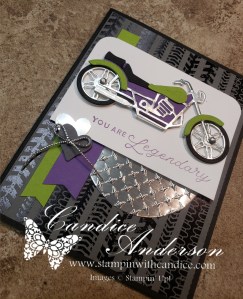
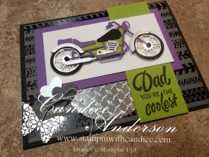
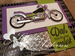
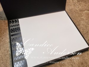
I had a lot of fun with these cards. My husband and I actually met when I asked him for a ride on his motorcycle almost 30 years ago. His favorite colors are purple and green so when I finally had a chance to play with this set I had him help me with the coloring. You’ll notice that the motorcycles vary a bit from each other as I played with different combinations. I’m featuring the Ready to Ride DSP which is part of the Suite Collection along with the Silver Foil that has been embossed.

  • 160754 – Legendary Ride Stamp Set (C) (M)
  • 160762 – Legendary Ride Dies (C) (M)
  • 160763 – Legendary Ride Bundle (R) (M)
  • 160768 – Ready to Ride Suite Collection (R) (M)
  • 160766 – Metal Plate 3DEmbossing Folder (C) (M)
  • 160767 – Adhesive-Backed Studs (R) (M)
  • 160752 – Ready to Ride DSP (R) (M)
  • 160382 – Country Bouquet Punch (C) (M)
  • 156457 – Silver Foil 12 x 12 Specialty Paper (R)
  • 155766 – Simply Elegant Trim (C)
  • Colors – Gorgeous Grape (C), Parakeet Party (C), Basic White (C), Basic Black (C), Basic Gray (C)

(R) Retiring, (C) Carrying Over, (M) Found in the Mini Catalog

Here’s one more card using this suite. I will list the additional products used along with the colors. One of the things I love about his card is how well the large watercolor world stamp set works so well with the motorcycle.

  • 160708 – Watercolor World Stamp Set (C) (M)
  • Colors – Pumpkin Pie (C), Basic Grey (C), Sahara Sand (R), Basic Black (C)

I am in love with this quick and easy layout. I’ve actually made multiple cards using this layout. I was going off a similar layout and cut the paper the wrong size however once I did I decided I liked this size even better. This card works perfect with our DSP. Simply cut your DSP into 4 x 8. You can get four cards out of one piece of DSP and still have a 4×4 square left for other projects. To finish you will score it at 2″ and 4″. Attached the 4×4 section to a 4 1/4″ by 4 1/4″ background and decorate how you want. The main image is designed to be centered and only attach to half the card when folded back like a Z-Fold card. This hides the image below which is in a similar shape.

  • 155092 – Butterfly Brilliance Stamp Set (R)
  • 155766 – Simply Elegant Trim (C)
  • 159245 – Pretty Prints DSP (R)
  • 155523 – Brilliant Wings Dies (R)
  • 159183 – Stylish Shapes Dies (C)
  • 155536 – Inspired Thoughts Stamp Set (R)
  • 154289 – Opal Rounds (R)
  • Colors – Blackberry Bliss (C), Rich Razzleberry (R), Basic White (C), Shaded Spruce (C)

(R) Retiring, (C) Carrying Over

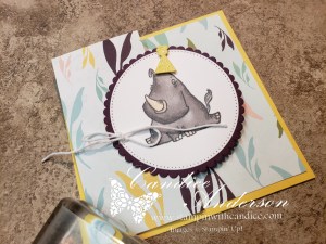
Here’s another sample using the same design. This one features the darling Rhino Ready online exclusive stamp set. This time I used circles rather than squares and the hostess designer series paper.

  • 160959 – Rhino Ready Stamp Set (O)
    • Rhino Ready Dies – Currently Unavailable -Online Exclusive
  • 159161 – Design a Daydream DSP (R)
  • 151770 – Layering Circles Dies (R)
  • 159183 – Stylish Shapes Dies (C)
  • 155475 – Baker’s Twine Essentials Pack (C)
  • 133456 – Memento Ink (C)
  • 154904 – Smoky Slate Stampin’ Blends (C)
  • 154893 – Petal Pink Stampin’ Blends (C)
  • Colors – Blackberry Bliss (C), Daffodil Delight (C), Old Olive (C), Basic White (C)

(R) Retiring, (C) Carrying Over, (M) Found in the Mini Catalog, (O) Online Exclusives


Please feel free to contact me if you have any questions.

Order online
Click on the shop now button.
Contact me today to place your order
or book your party!
435-232-2655 Cell ( Call or Text)
andersoncandice@hotmail.com Please feel free to contact me if you have any questions.