Create Unique Backgrounds with Nature’s Symphony Techniques

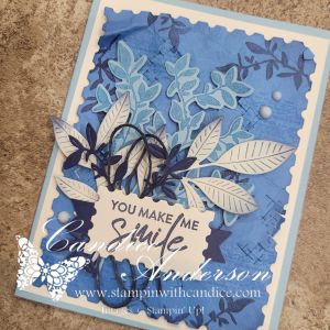
This week the Global Design Project featured another color challenge using Night of Navy, Azure Afternoon, and Balmy Blue. I briefly considered using December’s Product of the Month since those blues would have worked perfectly, but in the end I decided to do something a little different and create my own background paper.

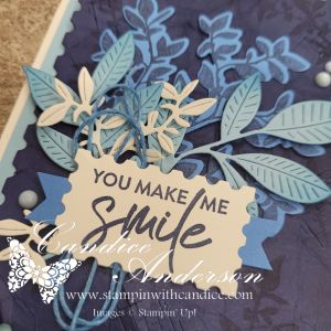
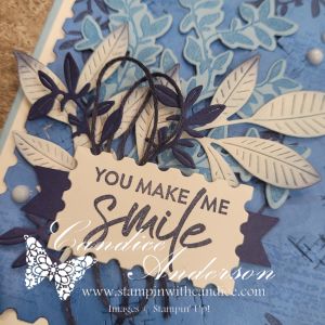
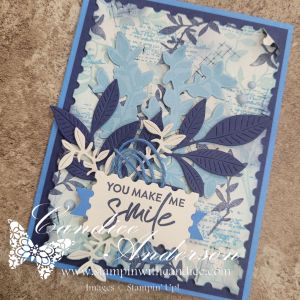
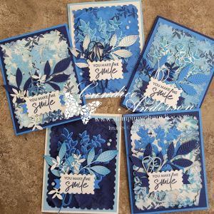
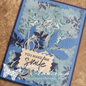
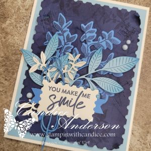
I pulled out the Nature’s Symphony Stamp Set (#166919) and Dies (#166925) and had so much fun experimenting that I ended up mixing and matching the technique with several different background colors. Each one turned out completely unique. Can you guess which one was my original? I’ll give you a hint—it started with Very Vanilla cardstock, which I really love because it highlights the technique.
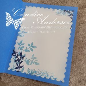
Creating the Textured Background

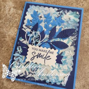
I originally planned to stamp the image and let it peek through the die-cut opening, but once I started playing, I realized I wanted even more texture. Instead, I layered stamped and die-cut elements to really build depth.

To make your own background, start with a piece of Very Vanilla cardstock cut with the second-largest die from the Perennial Postage set (#162607).

  • Stamp the large leaf image randomly in Balmy Blue
  • Add the textured line image in Azure Afternoon
  • Finish by stamping the small leaf in Night of Navy

Now for the fun (and slightly scary) part—crumple the paper. Yes, really! Squish it up to create a rough, worn texture full of dimension. Once flattened out a bit, use Blending Brushes (#160518) with Balmy Blue and Night of Navy to add even more depth.
Adding Extra Texture

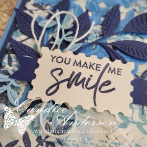
In the Nature’s Symphony die set, there’s a small die made up of hash marks. It doesn’t cut out an image—it cuts tiny hash marks creating textures instead. Run this die across your background in multiple directions. After sending it through the Cut & Emboss Machine, the paper will be flatter again, so go ahead and crumple it one more time. Be gentle—those cut areas can catch—but allow some sections to bend and open for even more interest. Add a little extra ink with your blending brushes to highlight those textured areas.
Finishing the Cards

Once the background was complete, all that was left was deciding what colors to stamp and die-cut for the remaining elements. I used the same technique on multiple cardstock colors, but Very Vanilla really lets all the details shine.

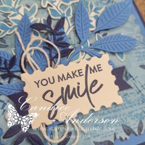
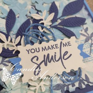
I finished each card by layering the die-cut elements, using Dimensionals behind the delicate leaf piece for added depth. A quick tip: if you cut the cardstock layer that sits behind your postage die piece to the correct size, you can die-cut one of the leaf shapes from the center first, saving cardstock before adhering it.

For the greeting, I used the second-smallest rectangle postage die, added small piece of paper that I used the Three Banner Punch #167050 to turn into a tach and finished with Very Vanilla Baker’s Twine behind it. Did you notice on some of the cards it isn’t very vanilla? I customized the twine color by brushing ink directly onto it with a blending brush—a great trick when you need ribbon in just the right shade. I always keep white or vanilla twine on hand for this reason. To finish things off, I added a touch of bling with Muted Palette Dots (#165155).

Final Result

In the end, I created five stunning cards, all using the same basic technique but each with its own unique look and feel. It may sound complicated, but it’s actually pretty easy once you try it—and I even made a hyper-speed video so you can see the whole process in action.

Which one do you think was my original? 💙


A beautifully crafted Christmas card featuring a window scene that displays a peaceful nativity setting on one side, while the inside is adorned with cozy holiday elements like hanging stockings and warm colors.

Please feel free to contact me if you have any questions.

Contact me today to place your order!
435-232-2655 Cell ( Call or Text)
andersoncandice@hotmail.com

💕 Let’s Stay Connected

📺 YouTube
📘 Facebook
📸 Instagram
📌 Pinterest

Easy Fun Fold Gift Card Holder Tutorial

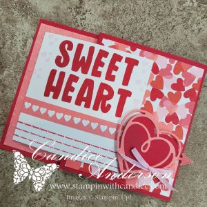
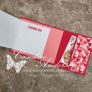
On my Monday Live, I shared an easy-to-make fun fold gift card holder inspired by my recent mini album. This sweet project features brand-new products that were released just yesterday, and I absolutely love how simple yet impressive this design is.

Card Base & Structure

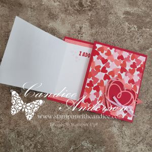
Start with a piece of Real Red cardstock cut to 4-1/4″ x 11″.
Score at 5-1/2″ and 9″.

  • The 5-1/2″ section will be on the left side of the card.
  • Fold the 2″ section inward, then fold again on the 5-1/2″ score line.
  • This creates a pocket on the inside of the card.

Secure the sides of the pocket using Tear & Tape (#154031), leaving the top edge open so you can tuck in a gift card or cash.

Inside Panel

Cut Flirty Flamingo cardstock to 5-1/4″ x 4″ and emboss it using the
Hearts of Love 3D Embossing Folder (#167071).

Attach this to the inside of the card on the 5-1/2″ x 4-1/4″ section.

Designer Series Paper

From the Made with Love Designer Series Paper (#167054), cut:

  • 4″ x 3-1/4″
  • 4″ x 1-3/4″

Place these pieces on:

  • The 3-1/2″ section folded to the front
  • The 2″ section folded inside to form the pocket

Left Folding Panel

Cut Basic White cardstock to 3-1/2″ x 7″ and score in half at 3-1/2″.

Stamp “Sweet Heart” from the Love Story Stamp Set (#167065) on the front and decorate as desired.

Attach this panel centered over the embossed section on the left side of the card base.

For one version, I placed the mini hearts directly on the white panel. For the second card, I added them to a 1/4″ strip of coordinating paper for a slightly different look.

Closure & Finishing Touches

For the closure, cut:

  • One solid heart
  • One lined heart

Using the Endless Love Dies (#167061).
Add arrows if you’d like for extra detail.

Attach the hearts to the front using Stampin’ Dimensionals, creating a small pocket for the folded panel to tuck underneath.

Finish the card with Bubble Bath Faux Linen Ribbon (#167075).


I love how simple and easy this fun fold gift card holder is to make, yet it has such a wow factor. Be sure to check out the video to see the step-by-step process, and I can’t wait to see your ideas using this design and these beautiful new products!


A beautifully crafted Christmas card featuring a window scene that displays a peaceful nativity setting on one side, while the inside is adorned with cozy holiday elements like hanging stockings and warm colors.

Please feel free to contact me if you have any questions.

Contact me today to place your order!
435-232-2655 Cell ( Call or Text)
andersoncandice@hotmail.com

💕 Let’s Stay Connected

📺 YouTube
📘 Facebook
📸 Instagram
📌 Pinterest

Finding Inspiration Through Casing a Designer | #GDP528

Casing Inspiration: Three Unique Card Designs

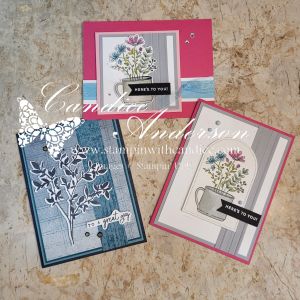
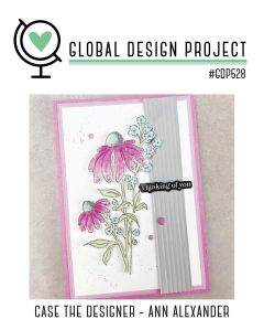
A card design featuring pink flowers and blue accents, with a stamped greeting saying 'Thinking of you,' framed by a gray vertical panel, and a pink border.

I don’t know about you, but inspiration is often one of the hardest parts of creating. Looking at what you have and figuring out how to turn it into something that not only speaks to you—but to others as well—can feel overwhelming at times. That’s where casing comes into play.

Casing (Copy And Share Everything) is one of my favorite ways to spark creativity. I often look to other designers when I need a jump-start, and the Global Design Project – Case the Designer challenges are a perfect source of inspiration.

This week we cased designer Ann Alexander, and during my live I shared how I pulled different elements from her card to inspire three very different designs of my own.


Card One – Same Layout, New Look

A handmade card featuring a botanical illustration of leaves in white on a textured blue background, with a greeting that says 'to a great guy'.

For my first card, I stayed fairly true to the original layout, but changed things up by using very different colors and imagery. I started with one of the new suites coming in January, Nature Walk (#166936), and used several elements from the suite including the stamp set, dies, Designer Series Paper, and embellishments.

To keep this card simple, I let the DSP do most of the work and added a stamped leaf image in Secret Sea along with a simple greeting. This is a great example of how keeping the layout but changing the products can completely transform a design.


Card Two – Color Combo with a Twist

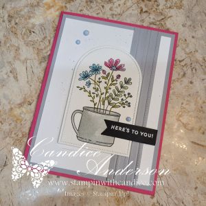
Card featuring a floral arrangement in a cup with a greeting that says 'HERE'S TO YOU!', set against a layered background of gray and pink.

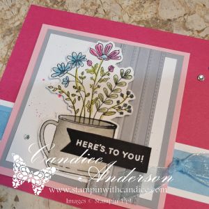
For my second card, I wanted to focus more on the color inspiration while still using the basic design—this time with a bit of a twist. Because the floral image in Weekend Adventures (#167318) isn’t a large focal image like the cased card, I chose to frame it using the Everyday Arches Dies (#164629).

I stamped the image on Watercolor Paper (#149612) and colored it using Water Painters (#168253) with ink pads for a soft, blended look. The greeting was heat-embossed in white on black cardstock and punched out using the Banner Sayings Bundle (#167051).

To add texture, I used the Lovely Stripes 3D Embossing Folder (#167179 – coming in January) and kept the color palette clean and bold with Melon Mambo and Smoky Slate cardstock. I finished the card with Muted Palette Dots (#165155) for a subtle pop of detail.


Card Three – Smaller Scale, Same Inspiration

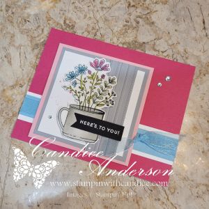
My final card is the one I demonstrated during the live. I kept the same core color palette from card two, but added Balmy Blue and Pretty in Pink cardstock for a softer feel.

This time, I resized the layout to better fit the smaller image by cutting the design down and adjusting the focal point. I also flipped the card and went with a horizontal design rather than a vertical one. I layered Balmy Blue Sheer Ribbon (#165767) behind the image and finished the card with Rhinestone Basic Jewels for just the right amount of sparkle.


A Simple Splatter Technique (Used on All Three Cards)

Across all three cards, I used one of my favorite easy splatter techniques with ink pads and Water Painters. What I love about this method is how versatile it is—you can splatter in any color, make the drops big or small, and it won’t ruin your marker tips or waste ink.

Be sure to watch the video to see just how quick and easy this technique really is!


One Design, Endless Possibilities

A display of three unique greeting cards featuring floral designs, each in different color schemes and layouts. The cards showcase a mix of elements such as stamped images, embellishments, and various backgrounds.

Seeing all three cards together really highlights why I love casing a designer so much. Even though each card was inspired by the same original design, they each have their own personality.

  • One focuses on layout with a fresh color palette
  • One leans into color inspiration with a bold, textured feel
  • And one adjusts the scale and proportions to better fit the image

By changing just a few key elements—colors, focal point size, textures, and embellishments—you can completely transform a design while still honoring the original inspiration.

The final result is three different and unique cards, all sparked by the same design. That’s the beauty of casing—it’s not about copying, it’s about letting someone else’s creativity jump-start your own.

So the next time you’re feeling stuck, take a look at the work of designers you admire and see what elements you can borrow to get your creativity flowing. Let their creativity spark your own. Remember—there’s no right or wrong way to case a card. The goal is simply to get those creative juices flowing and make it yours.


A beautifully crafted Christmas card featuring a window scene that displays a peaceful nativity setting on one side, while the inside is adorned with cozy holiday elements like hanging stockings and warm colors.

Please feel free to contact me if you have any questions.

Contact me today to place your order!
435-232-2655 Cell ( Call or Text)
andersoncandice@hotmail.com

💕 Let’s Stay Connected

📺 YouTube
📘 Facebook
📸 Instagram
📌 Pinterest

🌿❄️ Global Design Project #GDP525 — Two Cards, Two Seasons, One Gorgeous Color Combo!

This week’s Global Design Project color challenge (#GDP525) features the stunning trio of Cloud Cover, Lost Lagoon, and Highland Heather. WOW—these colors are absolutely beautiful together! At first glance, they totally gave me winter vibes… but once I started creating, I realized they could go in so many different directions.

And of course, once I made one card, I just couldn’t stop at one.
So today I’m sharing two cards with the same layout—one floral and one snowman!
Same sketch, two completely different feels. I love when that happens!


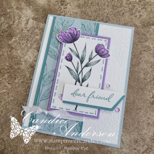
🌸 Card 1: Soft & Dreamy Floral Design

Inspired by a lovely card I saw earlier today by StampinFancyFriday.

I started with the challenge colors and decided to step away from the obvious winter theme. Instead, I leaned into how soft and fresh these colors feel together and created a floral card. The muted tones mixed with a pop of Highland Heather gave it such a gentle, uplifting vibe.

What I love about this card:

  • How versatile the colors become outside of winter
  • The soft gradients between Lost Lagoon and Cloud Cover
  • The simple layout that really lets the colors shine
A handmade floral greeting card featuring three purple flowers with green leaves, layered on a soft blue background and bordered by a light purple frame. The card includes a white rectangular label with the text 'dear friend' on it.

Supplies Used:

  • Spotlight on Nature (163579)
  • Exposed Brick Embossing Folder (161600)
  • Misty Moonlight and White Ribbon (165276)
  • Frosted Iridescent Dots (165766)

⛄ Card 2: Snowman Winter Birthday Card

Okay… once the floral card was done, I just couldn’t resist!
I pulled out one of my favorite retired snowman sets because these colors are perfect for a frosty, wintery design.

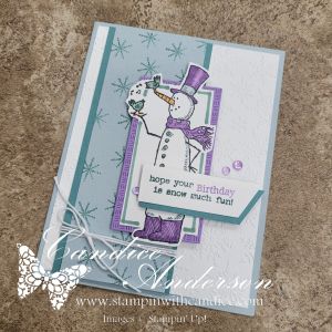
I kept the exact same layout, but this time swapped the Christmas sentiment — making it a winter birthday card. The color combo brought the snowman to life in such a sweet, chilly way.

What makes this version fun:

  • Perfect use of a beloved retired stamp set
  • Great twist on a winter birthday card
  • Proof that one layout can create multiple completely unique cards
A winter birthday card featuring a cheerful snowman wearing a purple hat and scarf, holding a small bird. The card uses soft pastel colors and includes the sentiment 'hope your Birthday is snow much fun!' against a textured background with snowflakes.

✨ Same Layout, Two Moods

One of my favorite parts of cardmaking is seeing just how far a single layout can stretch! With just a few creative shifts, you can take a card from springtime softness to winter whimsy—all using the same sketch and color combo.

I’d love to know:
👉 Which version do you like better—the floral or the snowman?
👉 Have you tried the #GDP525 challenge yet?

Graphic for the Global Design Project #GDP525 featuring three hearts representing the colors Highland Heather, Cloud Cover, and Lost Lagoon.

Be sure to check out the challenge and share your creations, too!

Thanks so much for stopping by and creating with me today.
Happy stamping! 💜💙🤍


A beautifully crafted Christmas card featuring a window scene that displays a peaceful nativity setting on one side, while the inside is adorned with cozy holiday elements like hanging stockings and warm colors.

Please feel free to contact me if you have any questions.

Contact me today to place your order!
435-232-2655 Cell ( Call or Text)
andersoncandice@hotmail.com


💕 Let’s Stay Connected

📺 YouTube
📘 Facebook
📸 Instagram
📌 Pinterest

#StampinWithCandice #StamperCandi #GDP525 #StampinUp #CardMaking #ColorChallenge #HandmadeCards #SnowmanCard #FloralCard

Scrapped! Episode 30 – Gratitude Mini Album

A Beautiful Way to Celebrate What Matters Most

November always inspires me to slow down and reflect on the things I’m most grateful for. For Scrapped! Episode 30, I wanted to create something that captured those heartfelt moments in a way I could revisit year after year. Instead of a traditional scrapbook page, I designed a Gratitude Mini Album—a keepsake filled with texture, layers, and interactive elements that make memory keeping both meaningful and fun.

This mini album is built using our Flip Flaps and features gorgeous pull-outs, flaps, pockets, and hidden journaling spots. It’s the perfect way to document gratitude, seasonal reflections, or family traditions during the holidays. And because the album structure is so versatile, you can recreate it for any theme—thankfulness, celebrations, travel, or even a yearly highlight book.

🎥 Be sure to watch the episode for a closer look at how the project comes together and ideas for customizing your own album.


About the Album

For this project, I started with chipboard (the kind that comes in Paper Pumpkin kits or many of our other crafting kits—recycling win!) to create sturdy front and back covers. The inside includes multiple sizes of Flip Flaps, thoughtful fold-outs, a waterfall element, reinforced center pages, and plenty of spaces for photos, journaling, and decorative touches.

Once the structure was built, I decorated the album using the warm, earthy tones of the Gathering Together Suite (165987), which felt absolutely perfect for a gratitude theme. The stamps, dies, textures, and embellishments all came together beautifully to create a heartfelt, cozy design.

Featured Products

Gathering Together Suite (#165987)

  • Gathering Moments Stamp Set (#165970)
  • Gathering Moments Dies (#165979)
  • Gathering Together Designer Series Paper (#165969)
  • Gathering Leaves Embossing Folder (#165983)
  • Early Espresso & Old Olive Baker’s Twine Combo (#165986)
  • Cajun Craze and Gold Dots Embellishments (#165984)

I also pulled sentiments and decorative elements from:

  • Just a Note Stamp Set (#166098) + Dies (#166101)
  • Our Story Stamp Set (#167109)
  • Celebrate Together Stamp Set (#166655)

👉 You can shop current Stampin’ Up! supplies and tools here:
Shop with Me Here

The color palette—Basic Beige, Cajun Craze, Crushed Curry, Early Espresso, Old Olive, and Champagne Foil—set the warm and inviting tone that makes this mini album feel extra special.

I loved this project so much that I’m already working on a Christmas version with a fun twist on the layout—so stay tuned!


Want to Make This Album Yourself?

You can absolutely create your own version of this Gratitude Mini Album—and I’ve made it easy!

Gratitude Mini Album Tutorial

$10.00 USD

✨ FULL step-by-step tutorial, including:

  • complete measurements
  • detailed instructions
  • cutting guides
  • photos
  • tips for customizing
  • and a full supply list
cards
Powered by PayPal

Whether you’re documenting memories for yourself or creating a heartfelt handmade gift, this album is something you’ll treasure year after year.


A beautifully crafted Christmas card featuring a window scene that displays a peaceful nativity setting on one side, while the inside is adorned with cozy holiday elements like hanging stockings and warm colors.

Please feel free to contact me if you have any questions.

Contact me today to place your order!
435-232-2655 Cell ( Call or Text)
andersoncandice@hotmail.com

💕 Let’s Stay Connected

📺 YouTube
📘 Facebook
📸 Instagram
📌 Pinterest

Day 30 – Let It Snow!

Merry Little Moments & a Snow-Kissed Finale ❄️

Wow… I can’t believe this is the end of the 30-day challenge. I’m honestly so proud of myself for participating in both challenges every single day. This month stretched me, inspired me, and filled my craft room (and heart!) with joy. Thank you for being here with me through it all!

Today’s theme was Let It Snow – Merry Little Moments, and the goal was to create an all-white card using white layers, vellum, and sparkle for a snow-kissed look. And let me tell you… this one really challenged me.


❄️ Attempt #1… and Why I Started Over

My first try used gold and some retired products, and while it wasn’t bad, it wasn’t the pure snowy look the challenge called for. So I scrapped it and decided to try again.

This time, I went looking for inspiration and came across a gorgeous design I had cased before by the wonderfully talented Melody Hyde. Her vision jump-started my creativity, and I began brainstorming ways to tweak her idea to make it my own.


🎄 A Frosty, Sparkling Design

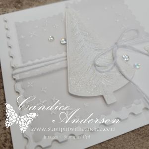
I stamped the tree from the Ornamental Christmas Stamp Set (#165991) with white ink and embossed in white then cut with the matching Dies (#166000) I used the Perennial Postage Dies (#162607) to create a layered, textured winter scene.

Vellum Panels

I die-cut three small postage shapes from vellum, then stamped the star image from Spooky Halloween (#166192) in White Craft Ink and heat-embossed them in white.

The soft vellum + snowy embossing instantly gave the perfect frosty feel.

The BRR Message

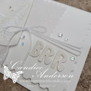
Using the Mini Alphabet Dies (#162934), I cut out the letters BRR.
Tip: To add dimension without wrestling tiny pieces of Dimensional foam, I rolled up Mini Glue Dots to pop the letters up slightly. Perfect lift—zero frustration!

I also brushed each letter with Wink of Stella for a sparkly, icy shimmer.


✨ Wink of Stella Magic

Did you know you can use Wink of Stella with the emboss resist technique?
I used it on my die-cut tree, and the sparkle settled right into the embossed design. It created the most beautiful, snowy glow—subtle but magical.


🎀 Finishing Details

To complete the card:

  • I tied it together with White Baker’s Twine
  • Added Frosted Iridescent Dots (#165766) for the perfect snow-kissed sparkle
  • Kept everything in soft whites and vellum layers for that peaceful winter moment

This final project feels serene, frosty, and completely fitting for the last day of the challenge.


❤️ Reflecting on the Challenge

One of today’s prompts was to share my favorite card from the entire month… and honestly? I’m not sure I can. There were so many I loved creating for different reasons.

But my favorite part of this challenge wasn’t any single card—
it was sharing each project with you, reading your comments, and having you join me along the way. Thank you again to everyone who crafted, encouraged, watched, liked, or simply followed along.

A digital banner for a card-making challenge featuring a snowy blue background with snowflakes, text reading 'Card a Day in November! Card Making Challenge Christmas Card Edition DAY 30 Let it Snow!'

I hope you’ll continue to join me as I keep sharing what I love.
Here’s to many more Merry Little Moments together. ❄️❤️


👉 You can shop current Stampin’ Up! supplies and tools here:
Shop with Me Here

A beautifully crafted Christmas card featuring a window scene that displays a peaceful nativity setting on one side, while the inside is adorned with cozy holiday elements like hanging stockings and warm colors.

Please feel free to contact me if you have any questions.

Contact me today to place your order!
435-232-2655 Cell ( Call or Text)
andersoncandice@hotmail.com

💕 Let’s Stay Connected

📺 YouTube
📘 Facebook
📸 Instagram
📌 Pinterest

#StampinWithCandice #StamperCandi #ACardADayInNovember2025 #30DayChristmasCardMakingChallenge #ChristmasCards #HandmadeCards #CreativeTechniques #HolidayCrafting #cardmaker #cardmaking #christmascards #handmadecards #papercraft #StampinUpKits #christmaschallenge