What the Heck Is Junk Journaling?

If you’re like me and follow a lot of crafting sites, you may have noticed something called “junk journaling” popping up in your feed. While it’s not exactly a new trend, it seems to have become more popular over the years. What I was seeing really intrigued me and pushed me to learn more about it.

I’m still at the beginning of my junk journaling journey, but I decided it was time to give it a try! Before I share my first attempt, I want to tell you a little about what I’ve discovered and, more importantly, my personal take on it.


What Is Junk Journaling?

From what I’ve seen, junk journaling is a form of memory keeping that is a little less structured and a lot more free-form and personal.

That’s not to say traditional memory keeping isn’t personal—of course it is! What I mean is that junk journaling seems to focus even more on giving the creator a place to express themselves rather than preserving memories specifically for others to enjoy later.

To me, junk journaling feels like a combination of scrapbooking, journaling, collage and personal creative expression.

And one of the things I love most about it? There really doesn’t seem to be a “right” way to do it!


So Why Try It?

Think of it as a creative outlet where you’re allowed to be messy, use up your scraps, embrace imperfection and tell your story your way.

It can still be a form of memory keeping, but instead of focusing primarily on what happened, as we often do in traditional scrapbooking, it can focus more on how you felt, what you noticed and what the experience meant to you.

You might include little bits and pieces that would normally be discarded—a receipt, ticket stub, packaging, a handwritten note or even that photo that isn’t quite “perfect” enough for your scrapbook page.

Sometimes it may simply be a collage of colors, words, textures and items that mean something only to the person creating it.

While junk journals can still be beautiful and fun to share, they can also be incredibly personal. Much like a traditional written journal, they give the creator an opportunity to express themselves—but with both words and pictures.

What Else Is Different?

The things that go into a junk journal are only part of what makes it different. Another fun aspect is the opportunity to make the journal itself an experience, rather than simply flipping through pages in a book.

We’re actually seeing more of this in traditional scrapbooking too, and Stampin’ Up!’s Flip Flaps are a perfect accessory for this type of memory keeping.

Junk journals are often filled with pockets, tags, hidden journaling, fold-outs and other interactive elements. There can be lots of layers, textures and dimension, creating thick pages and chunky books that don’t necessarily follow traditional scrapbook formats.

I also noticed that some junk journals have a very specific focus—a trip, holiday or special season of life—while others are much more open-ended. You might find journals filled with favorite quotes, gratitude, everyday moments, creative experiments or simply whatever inspired the creator that day.

Size and Structure – One of the other differences I noticed is that most junk journals are much smaller than traditional 12″ x 12″ or even 8½” x 11″ scrapbooks. They tend to be closer to the size of a notebook or journal you might purchase. The journal itself can take many forms, too. Some are made from purchased journals or old books, while others are handmade from individual pages held together with ribbon, binder rings, stitching, or other creative methods. One thing you’ll quickly discover with junk journaling is that there really isn’t a specific mold or “right” way to create one. The size, structure, pages, and binding can be as unique as the person creating it.

That freedom is part of what intrigues me!


So, What’s Next?

As I’ve searched for more information, I’ve found myself thinking about how I can incorporate some of these ideas into what I’m already creating.

There are elements of junk journaling that fit beautifully with scrapbook pages, fun fold cards and especially mini albums—which already include many of the same interactive characteristics.

I’m looking forward to learning some of these techniques and experimenting with how they can transfer back and forth between different types of paper crafting, while still maintaining my own personal crafting style.

I hope you’ll enjoy exploring right along with me!


Want to See My First Try?

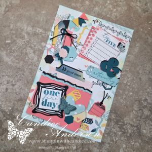
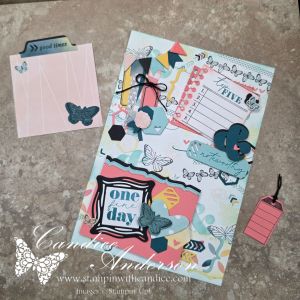
During my live, I created my first junk journaling project from scratch, so you can follow along as I experiment with the process and discover what works for me.

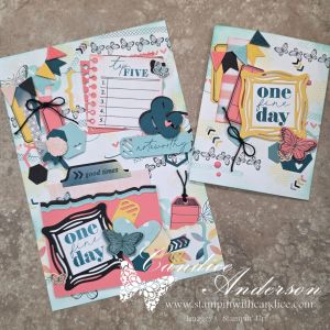
I chose to work with Beautiful Ordinary Life and the Extraordinary Life Bundle because I felt many of their elements fit naturally with junk journaling while still allowing me to give it a more modern twist.

In fact, I think the Extraordinary Life Scrapbooking Workshop Kit could be really fun to transform into a junk journal. That may have to be another experiment!

Starting Small

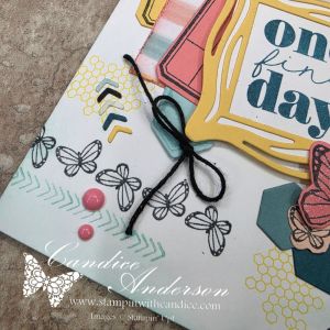
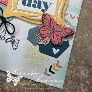
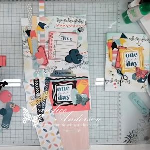
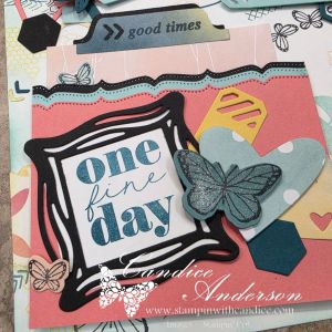
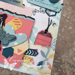
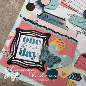
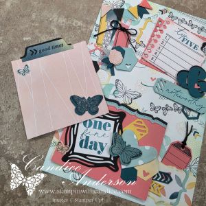
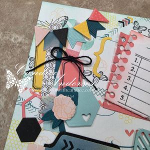
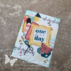
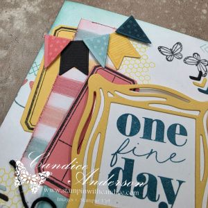
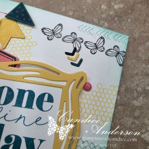
Before jumping into my journal, I decided to practice some of the techniques on a card first. The card features many of the carefree, layered elements that I incorporated into the junk journal cover I created during my live. This gave me an opportunity to try some of the ideas on a smaller scale before moving on to a larger page with even more elements.

As I worked through the creative process, I discovered a few things I wanted to share.

Give Yourself Plenty to Work With

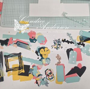
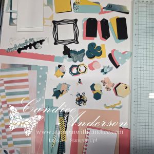
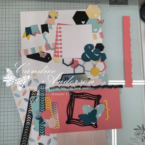
Because this was completely new to me, and I chose to work primarily with one suite rather than combining lots of different products, I started by cutting and stamping a variety of random pieces using the dies and stamps from the suite and bundle.

This gave me a collection of elements to pull from as I started creating both my card and my journal cover. Instead of stopping every few minutes to stamp or cut another piece, I could simply play with what I had and see how the different elements worked together.

Don’t Be Afraid of a Busy Background

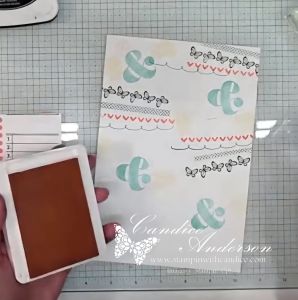
Another thing I noticed while watching junk journaling videos was how often the creators started with a fairly busy patterned background. Sometimes they used patterned paper, while other times they created their own background with random stamping.

For my project, I chose to focus on random stamping because there are so many great images in the suite and bundle that worked perfectly for this.

Rather than worrying about creating a perfectly balanced stamped background, I could simply add images here and there knowing that much of it would eventually be covered by additional layers.

Add Some Blending

I also noticed blending brushes being used quite a bit. Blending ink around the edges can help create that worn, weathered or vintage look you often see in traditional junk journals.

Even though I was going for a more modern look, I really liked what the blending added to my project. It softened some of the pieces, added depth and helped all of those different layers work together.

Embrace a Little Creative Chaos

One thing I commented on several times during my live was that the process felt a little chaotic—but not in a bad way. It was actually kind of freeing!

Once I had my background created, I started laying pieces down and moving them around to see what worked together. Instead of following a specific layout or worrying about exact placement, it became more about getting a feeling for what looked right and what allowed me to express myself.

Interestingly, I went through this process once before the live and then again during the live. Since I chose not to glue everything down during the video to save time, I had to recreate the layout afterward—and the final journal cover ended up a little different again!

I think that’s part of the fun. There doesn’t have to be one exact finished design you’re trying to reproduce.

Add Pockets & Little Surprises

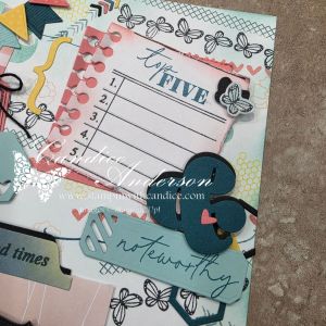
One other element I really wanted to focus on was incorporating some of the pockets, tags and elements of surprise that I had seen in other junk journals.

I shared my basic plan during the live, but I didn’t completely finalize how everything would work until afterward.

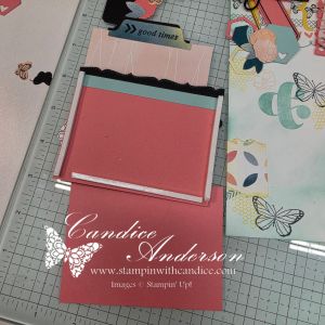
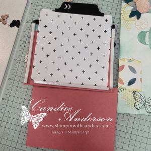
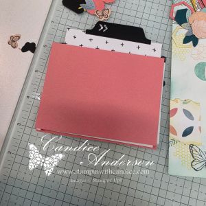
Because I ended up placing torn elements behind the area where my main pocket was going, I used foam adhesive strips along with an additional piece of paper to fully turn it into a functional pocket before attaching it to the page.

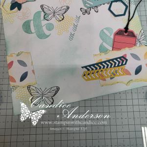
I also attached some of my torn paper pieces only along the sides and bottom, which created another little hidden pocket for one of my tags.

Those small changes gave me additional interactive elements while adding even more dimension to the project.

So…What Did I Think?

I honestly had more fun creating this than I thought I would, and I can definitely see the appeal of junk journaling now.

It’s still outside my comfort zone, but I think that’s part of what made it so much fun. It gave me permission to create differently—to layer more, worry less about perfect placement and simply see where the project took me.

I’m looking forward to exploring junk journaling more and seeing how some of these ideas can transfer across the other forms of crafting I already love.

And I’m not stopping there!

Be watching for this month’s Scrapped! episode, where I’ll turn the experiment around and explore how I can take some of these same junk journaling ideas and bring them back into traditional scrapbooking.

I have a feeling the lines between cardmaking, scrapbooking and junk journaling might not be quite as defined as I once thought!


Create It Your Way

Whether you choose traditional scrapbooking, mini albums, junk journaling, card making—or a little bit of everything—the important thing is finding a creative style that speaks to you.

There’s room to preserve the big memories, document the everyday moments, save those little pieces of life that might otherwise get thrown away and simply create because creating makes you happy.

No matter how you choose to preserve your thoughts and memories or let your creativity shine, I hope what I share inspires you to sit down, create and feel the joy it brings.

And since I’m learning too, I’d love to hear from you! Have you tried junk journaling? What do you love about it? Or, if you’re new to it like me, what would you like to learn?


No matter where your creative journey takes you, I’m so glad you’re here. Let’s learn, create, connect, and grow together—one project at a time. 🦋

A beautifully crafted Christmas card featuring a window scene that displays a peaceful nativity setting on one side, while the inside is adorned with cozy holiday elements like hanging stockings and warm colors.

💕 Let’s Stay Connected

📺 YouTube 📘 Facebook 📸 Instagram 📌 Pinterest
Creating Depth with One Color: Card Making Tips

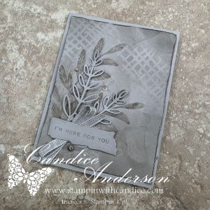
This week’s #TGIFC587 challenge was all about tone-on-tone, and I decided to really challenge myself by creating an entire card using just one color.

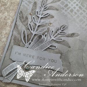
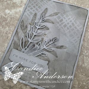
Rather than choosing a color you would typically expect with the Notes of Collage Bundle, I reached for Gray Granite. This is a sneak peek bundle (and I’m not even sure when it will be released!), but I couldn’t wait to create with it. I have to say… I absolutely love how this card turned out.

One of my goals was to show that a monochromatic card doesn’t have to feel flat. By layering several simple techniques, I was able to create lots of depth, texture, and contrast while staying true to a single color palette.

For the background, I die cut one of the abstract images and used the piece as a mask with a blending brush to softly add ink. Afterwards, I made sure my Gray Granite ink pad was freshly reinked so I could stamp the large leaf at full strength twice, then stamped the wispy leaf a several times using the stamp off technique for a softer, lighter impression.

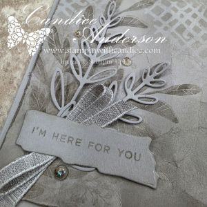
To add even more texture, I distressed the edges of the cardstock with my scissors before gently crinkling the panel. A little more Gray Granite ink brushed over the edges and creases helped highlight all of that wonderful texture. The delicate die-cut leaves, cut from Gray Granite cardstock, really stand out against the inked background without introducing another color.

I kept the sentiment monochromatic as well by stamping “I’m Here for You” in Gray Granite on a die-cut label. Finally, I finished the card with Gray Granite Variegated Ribbon and a few Mosaic Dots for just the right amount of sparkle and elegance.

This card was a wonderful reminder that sometimes limiting yourself creatively can actually open the door to new ideas. It’s amazing how much interest you can create with a single color by simply varying the depth of ink, layering textures, and adding dimension.

Have you ever challenged yourself to create a true monochromatic card using just one color? I’d love to hear which color you would choose or better yet share your creation in the comments or on my social media.

No matter where your creative journey takes you, I’m so glad you’re here. Let’s learn, create, connect, and grow together—one project at a time. 🦋

A beautifully crafted Christmas card featuring a window scene that displays a peaceful nativity setting on one side, while the inside is adorned with cozy holiday elements like hanging stockings and warm colors.

💕 Let’s Stay Connected

📺 YouTube 📘 Facebook 📸 Instagram 📌 Pinterest
Day 28 – Cardinals in Winter with Silent Sparkle

A Peaceful CASE of GDP524 Inspired by Cordula De

Today’s themes were all about the quiet beauty of winter—the hush of falling snow and the peaceful stillness it brings. When I saw the prompt, I immediately thought of the Global Design Project #GDP524, where we were challenged to CASE a gorgeous winter design by Cordula De. It was the perfect layout and technique for today’s soft, serene inspiration.

I’ve admired so many beautiful samples created for this challenge, and I wanted to keep my version simple and close to the original. The result is a calm, snowy design with just a touch of sparkle and one bright, cheerful pop of cardinal red.


❄️ Snowflakes & Soft Winter Hues

For the snowflakes since I don’t have the current set, I reached for the retired Joyful Flurry (#159804) stamp set. It was just the right style—delicate and elegant—for a peaceful winter card.

Color combo:

  • Pool Party
  • Lost Lagoon

Soft, icy, and perfect for silent snowfall vibes.

To build the background, I used a sneak peek of an upcoming product—
the Lovely Stripes 3D Embossing Folder (#167179).
It added gorgeous texture without overwhelming the design.


🟥 Adding a Subtle Cardinal Touch

The cardinal element turned out to be trickier than I expected—I realized I don’t have many bird stamps! But tucked deep in my stash, I found the perfect tiny cardinal in the very old Jolly Bingo Bits set. It was just the right size for a small pop of color without taking over the card.

I colored the little bird using my Stampin’ Write Markers (hot tip: these are on the Last Chance List, so make sure you grab yours before they’re gone!). I fussy-cut the cardinal and popped it up with a Mini Dimensional.


🎨 Masking, Texturing & Sparkling

For the main technique:

  1. I cut a piece of Masking Paper (#155480) to 1″ × 2-3/4″.
  2. I placed it where I wanted my sentiment to be, then stamped my snowflakes.
  3. For the two larger snowflakes, I stamped off first to soften the look.
  4. The smallest snowflake was stamped full strength for contrast.
  5. A little Wink of Stella added the perfect bit of winter sparkle.

To add texture to the focal panel, I lightly distressed the edges with the side of my scissors. It gives such a soft, handcrafted look.

And while the card didn’t need ribbon… I really loved the gentle touch it added.
I tucked a strip of the retired White Woven Ribbon (#164634) behind the focal piece and tied a tiny knotted embellishment with a Mini Glue Dot.


Quick, Easy, & Peacefully Wintery

This card came together so quickly—and I absolutely love the gentle, snowy look paired with that tiny burst of cardinal red. It’s amazing how a simple design can carry so much quiet charm.

👉 You can shop current Stampin’ Up! supplies and tools here:
Shop with Me Here

A beautifully crafted Christmas card featuring a window scene that displays a peaceful nativity setting on one side, while the inside is adorned with cozy holiday elements like hanging stockings and warm colors.

Please feel free to contact me if you have any questions.

Contact me today to place your order!
435-232-2655 Cell ( Call or Text)
andersoncandice@hotmail.com


💕 Let’s Stay Connected

📺 YouTube
📘 Facebook
📸 Instagram
📌 Pinterest
#StampinWithCandice #StamperCandi #ACardADayInNovember2025 #30DayChristmasCardMakingChallenge #ChristmasCards #HandmadeCards #CreativeTechniques #HolidayCrafting #cardmaker #cardmaking #christmascards #handmadecards #papercraft #StampinUpKits #christmaschallenge

Day 20 – Blessings of the Season

Scripture-Based Messages + Color Challenge #4

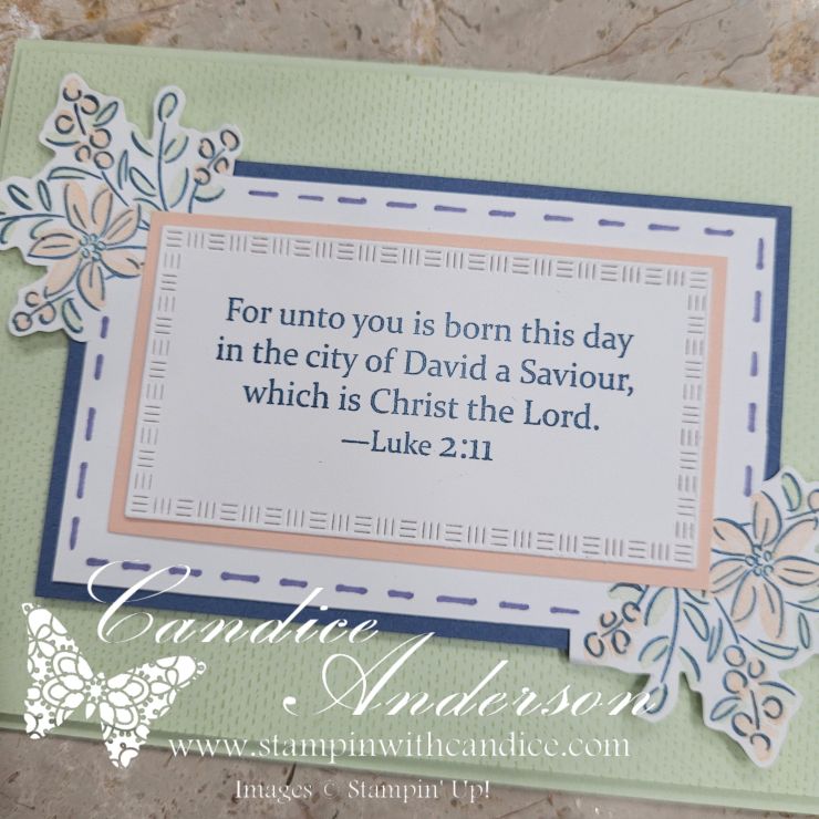
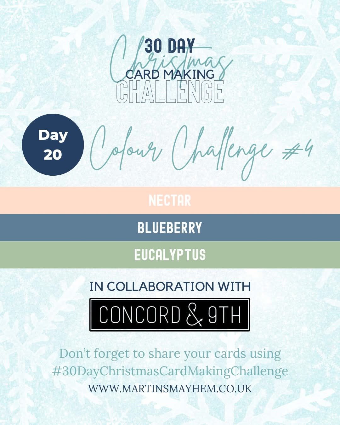
Today’s project blended two beautiful inspirations: Blessings of the Season, which called for scripture-based messages paired with gentle imagery, and Color Challenge #4 featuring the Concord & 9th palette of Nectar, Eucalyptus & Blueberry.

To coordinate with Stampin’ Up! colors, I selected Petal Pink, Soft Sea Foam, and Misty Moonlight—a soft and elegant combination that worked perfectly with the peaceful feel of the theme.


Simple, Elegant & Meaningful

For this card, I kept the design very simple to allow the scripture and imagery to shine.

I reached for the Gift of Joy Stamp Set (#169238) and used the lovely three-step flower images. The layered stamping made it easy to incorporate all three challenge colors while still keeping the design airy and light.

For my sentiment, I chose a scripture greeting from the retired Blessings of the Season set (#139919). After stamping, I die-cut it using the Textured Notes Dies (#165555) and then matted it with Petal Pink for just a touch of warmth.


Connecting the Details

To pull the design together, I stamped the flower images in opposite corners—top and bottom—creating a natural frame for the sentiment.

Then came one of my favorite parts: using a Blender Pen and a ruler to draw a soft dashed border connecting the two floral corners. Such a simple technique, but it adds so much charm! Once the entire panel was complete, I cut around it for a polished look.

For the background, I added a layer of Soft Sea Foam stamped with the brand-new Lasting Linen stamp (#167107). This subtle texture gives the finished card a gentle richness without overpowering the simplicity.


The Finished Card

The final result is simple, elegant, and filled with meaning—a quiet, beautiful design built around scripture, soft florals, and one of my favorite color combinations this season.

I love how this one turned out, and I can’t wait to try it again with different sayings in the center. It would be so easy to switch it up for birthdays, sympathy, encouragement, or even a simple “thinking of you.”

Sometimes the simplest layouts are the most versatile.

👉 You can shop current Stampin’ Up! supplies and tools here:
Shop with Me Here

A beautifully crafted Christmas card featuring a window scene that displays a peaceful nativity setting on one side, while the inside is adorned with cozy holiday elements like hanging stockings and warm colors.

Please feel free to contact me if you have any questions.

Contact me today to place your order!
435-232-2655 Cell ( Call or Text)
andersoncandice@hotmail.com


💕 Let’s Stay Connected

📺 YouTube
📘 Facebook
📸 Instagram
📌 Pinterest
#StampinWithCandice #StamperCandi #ACardADayInNovember2025 #30DayChristmasCardMakingChallenge #ChristmasCards #HandmadeCards #CreativeTechniques #HolidayCrafting #cardmaker #cardmaking #christmascards #handmadecards #papercraft #sketchchallenge #christmaschallenge

Stampin’ Up! Butterfly Dies Card

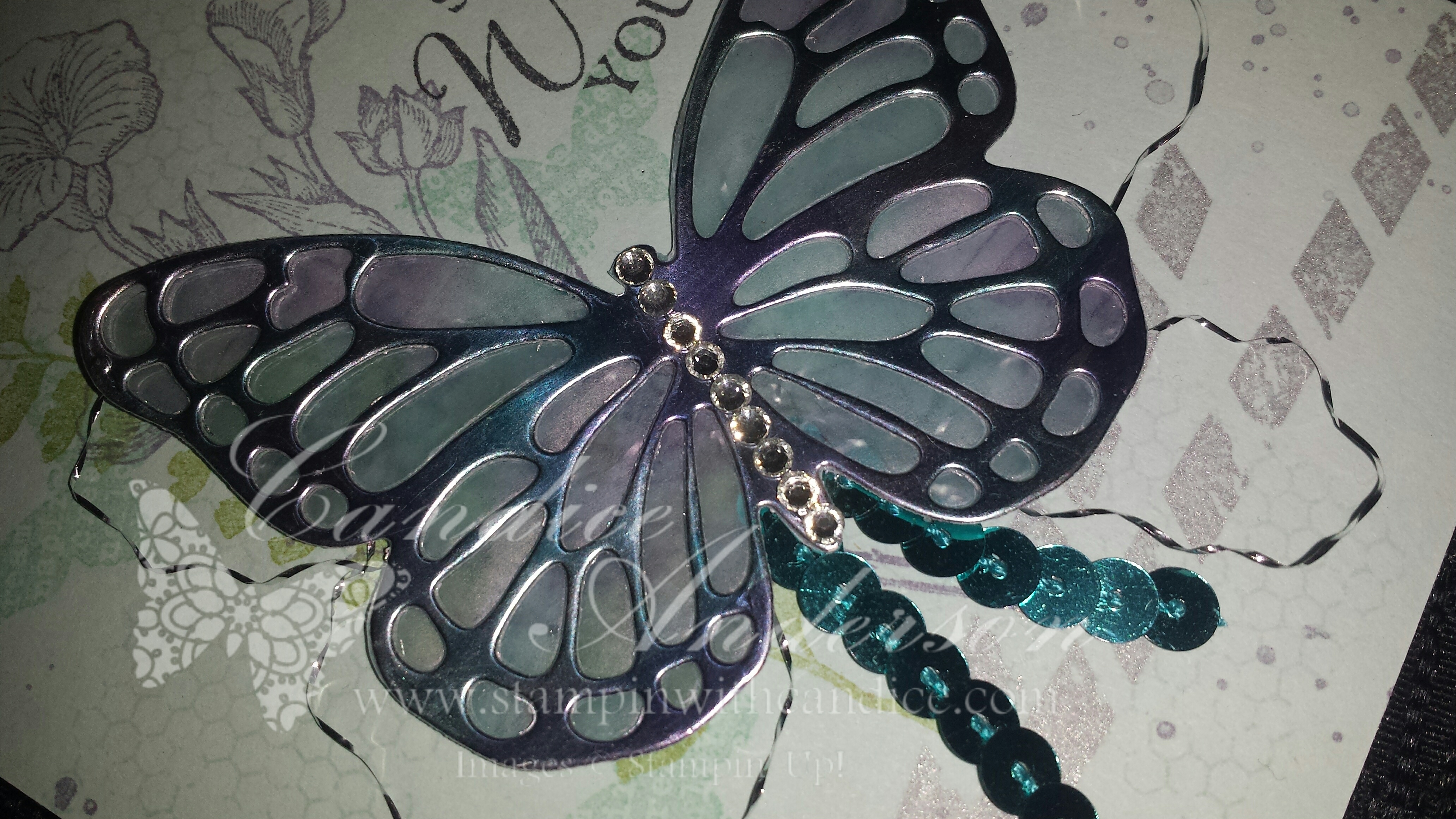
I was so excited to share this card with you and the day after I made the video I found out that Stampin’ Up! was discontinuing the blendabilities line due to inconsistency in manufacturing of the product.  I’m so sad that his product is no longer available as I absolutely love it.  In fact I only had one more color to get.  I truly hope and pray that they will be able to find a manufacture that can produce the quality the Stampin’ Up! desires so we can have these fabulous markers back.

I still wanted to share this card with you as you could still make it using the awesome Butterfly cards however you just wouldn’t have the fun effect that I added on the butterfly.  Just a note you can use our Stampin’ Write markers however you need to make sure they dry really well (they can smear some maybe even after drying) and they are quite as bold.
First here is the card.

Butterfly Die Card

Here is a close up of the butterfly.  I created the fun effect on the butterfly with the Blendabilites.  You can check out all the details in the video below.


Close up of butterfly

Here’s the video of how I created the metallic colorful butterfly and other details.  Below is a list of products needed.

  • Paper:
    Card Base- Soft Sky #131203 $6.95
    Butterfly-
    Silver Foil #132178 $3.95
    White Vellum #101856 $6.50
  • Ink Colors:
    Soft Sky #131181 $5.95Pear Pizzazz #131180 $5.95
    Wisteria Wonder #126985 $5.95
    Pool Party #126982 $5.95
    Black Memento Pad #132708 $5.95
    Silver Pad #132142 $9.95
  • Big Shot:
    Big Shot Die Cut Machine #113439 $99.95
    Magnetic Platform #130658 $39.95
    Butterflies Thinlits Dies #137360 $24.95
  • Stamp Sets:
    Butterfly Basics:
    Wood #138813 $47.95
    Clear #138816 $35.95
    Photopolymer #137154 $23.95
    Gorgeous Grunge:
    Wood #13514 $24.95
    Clear #130517 $17.95
  • Accessories:
    Silver Metallic Baker’s Twine #132976 $3.50
    Rhinestone Basic Jewels #119246 $4.95
    Bermuda Bay Sequin Trim #137910 $4.95
    Mini Glue Dots #103683 $4.95
  • Blendabilites: (Sorry no longer available)
    Bermuda Bay
    Wisteria Wonder

Please feel free to comment if you have any questions.  Thanks so much for checking out my post.  Have a Stamptastic Day!

Tag SignatureOrder online 24/7
Contact me to order or book your party today!
435-245-5321 Home
435-232-2655 Cell ( Call or Text)
andersoncandice@hotmail.com


Reverse Masking Technique

Masked Butterfly Card

I found this awesome technique on YouTube.  Of course it caught my eye since it was my up-line doing the demonstration, but I absolutely loved the technique.  It’s really pretty easy to do.  I created a bunch of these to send out.  Maybe you’ll be one of the lucky ones to get one.

En Francais
#109521 – Wood $17.95

Sweet Essentials
#126455- Wood $19.95
#126457- Clear $14.95

Beautiful Butterflies Bigz Die
#114507 $21.95

Owl Builder Punch
#118074 $16.95

Pearl Basic Jewels
#119247 $2.95

Colors- Naturals White, Pool Party, Island Indigo, Cherry Cobbler.

Here’s the Video if you’d like to check out how it was done.


Here are some other cards I made using the same technique.

This one is using the Happy Whale die in the Spring Catalog along with the Beyond Plaid set.

*Beyond Plaid#129201 – Wood $23.95
#129204- Clear $17.95

*Oh, Whale!
#129129- Wood $22.95
#129132- Clear $16.95

*Happy Whale Clearlits Die
#129403 $7.50

Stampin’ Spritzer
#126185 $2.95

Pearl Basic Jewels
#119247 $2.95

Colors- Whisper White, Pool Party, Island Indigo, Cherry Cobbler.

Masked Thanks a ton cards

This one was created using the Perfect Pennants Die.

*Beyond Plaid
#129201 – Wood $23.95
#129204- Clear $17.95

You’re Amazing
#126720- Wood $30.95
#126722- Clear $22.95

Perfect pennants Bigz L Die
#123126 $32.95

*Ovals Collection Framelits Dies
#129381 $26.95

*Natural 7/8″ Cotton Ribbon
#127844 $7.95

Stampin’ Spritzer
#126185 $2.95

Colors- Naturals Ivory, Pool Party, Old, Olive, Soft Suede

Masked Pendent Birthday Card

I hope you will take a minute and try this fun technique.  I’d love for you to share your creations with me. Just e-mail them to: andersoncandice@hotmail.com or share them on my Facebook page.  

If you post them on-line you can leave a link to them in the comment box.  Share them by the end of the month.  Next month I will draw a name from those who shared and send them a free gift.

5-May