July Paper Pumpkin Meets a Sketch Challenge

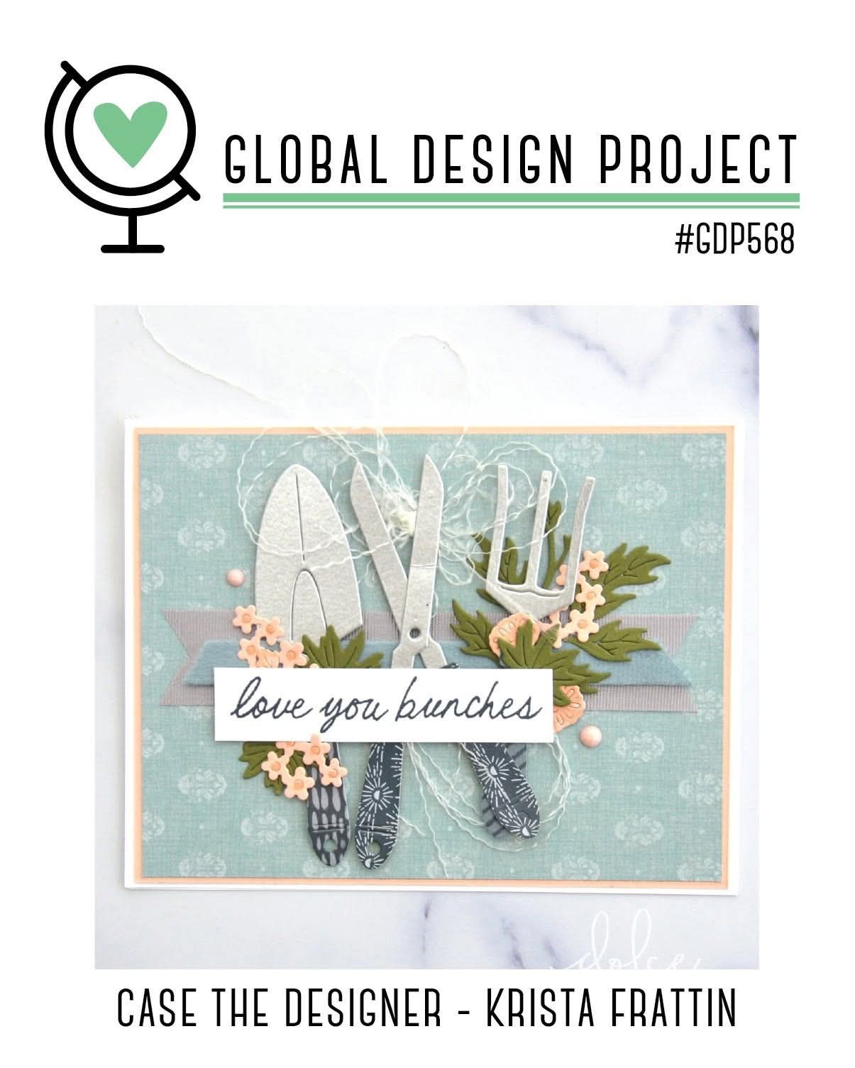
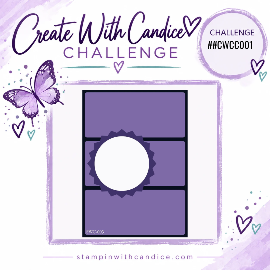
For this week’s Global Design Project Sketch Challenge #GDP558, I was inspired by my July Paper Pumpkin kit. This month’s kit featured easy-to-create easel cards, and I absolutely fell in love with the flowers, sentiments, and coordinating add-on dies. They were the perfect combination for bringing this week’s sketch to life.

I decided to stick with the same beautiful color palette from the kit: Hydrangea Hue, Timid Tiger, Melon Mambo, Darling Duckling, and Old Olive. I love how bright and cheerful these colors are together. While the Paper Pumpkin cards used softer tones, I created a similar look by stamping some of my images at full strength and others stamped off for a lighter shade.

Creating the Floral Panels

The sketch featured four rectangles separated by narrow spaces, so I reached for the Rounded Rectangle Punch to create my four panels.

I started with Basic White cardstock, stamping the leaves in Old Olive around the corners before adding flowers in Melon Mambo and Timid Tiger (stamped off). My goal was to create a floral frame around each rectangle while leaving the centers clean and open.

Next came my favorite part—adding dimension!

Using the coordinating add-on dies, I cut flowers from Hydrangea Hue, Timid Tiger, and Darling Duckling, along with leaves in Old Olive. Instead of leaving the leaves attached to their stems, I snipped them apart and tucked them throughout the design anywhere I wanted a little extra greenery.

Several of the flowers were popped up with Stampin’ Dimensionals for added depth. I even allowed some of the flowers to extend past the edges of each panel before trimming them flush once everything was adhered. This helps create the illusion that the floral arrangement continues beyond the edges.

The finished panels were attached to a 3¼” × 5″ piece of Basic White cardstock using additional Dimensionals.

Adding the Sentiment

For the greeting, I stamped “hooray” in Melon Mambo on Basic White cardstock and carefully fussy cut it. The “it’s your day!” sentiment was stamped in Timid Tiger and cut using the Triple Banner Punch.

To pull everything together, I wrapped Crisp Cantaloupe Ribbon around the center of the card and tied it with White Baker’s Twine.

One thing I love about Stampin’ Up! products is how well many of the colors coordinate, even when they aren’t exact matches. The Crisp Cantaloupe ribbon paired beautifully with the softer stamped-off Timid Tiger images and tied the entire card together.

Creating the Easel Card Base

The card base is Hydrangea Hue cardstock, cut to 11″ × 4¼” and scored at 5½” and 2⅛” to create the easel fold.

I wanted to recreate the subtle plaid background from the Paper Pumpkin cards, so instead of embossing with the Forever Plaid 3D Embossing Folder, I tried a different technique.

I inked the embossing folder, laid my cardstock onto the inked surface, and rolled over it with my Stampin’ Brayer. This transferred the plaid pattern without adding texture, which kept the fold nice and smooth while still giving me the look I wanted.

To finish the front, I adhered only the bottom portion of the white panel to the lower section of the card base so the easel mechanism could function properly.

Finishing the Inside

For the inside, I added a 3¾” × 5″ piece of Basic White cardstock.

I stamped the grid image three times in Timid Tiger, then stamped the “hugs & wishes” sentiment in the same color and punched it out with the Triple Banner Punch.

I attached the banner with Stampin’ Dimensionals, allowing it to act as the stopper that holds the easel card upright—just like the original Paper Pumpkin design.


Final Thoughts

This was such a fun card to create, and I know I’ll be reaching for these stamps and coordinating dies again soon. It’s always exciting to take inspiration from one project and transform it into something completely new.

Check out this sneak peek of what’s to come!


No matter where your creative journey takes you, I’m so glad you’re here. Let’s learn, create, connect, and grow together—one project at a time. 🦋

A beautifully crafted Christmas card featuring a window scene that displays a peaceful nativity setting on one side, while the inside is adorned with cozy holiday elements like hanging stockings and warm colors.

💕 Let’s Stay Connected

📺 YouTube 📘 Facebook 📸 Instagram 📌 Pinterest

Creating Depth with One Color: Card Making Tips

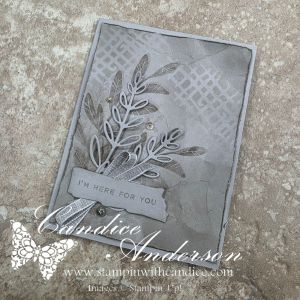
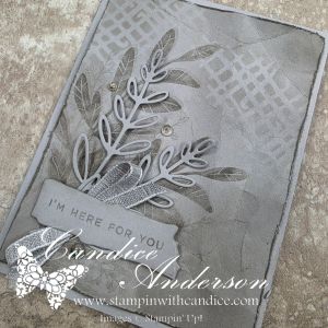
This week’s #TGIFC587 challenge was all about tone-on-tone, and I decided to really challenge myself by creating an entire card using just one color.

Rather than choosing a color you would typically expect with the Notes of Collage Bundle, I reached for Gray Granite. This is a sneak peek bundle (and I’m not even sure when it will be released!), but I couldn’t wait to create with it. I have to say… I absolutely love how this card turned out.

One of my goals was to show that a monochromatic card doesn’t have to feel flat. By layering several simple techniques, I was able to create lots of depth, texture, and contrast while staying true to a single color palette.

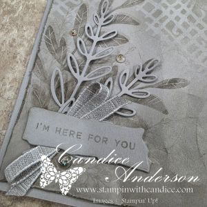
For the background, I die cut one of the abstract images and used the piece as a mask with a blending brush to softly add ink. Afterwards, I made sure my Gray Granite ink pad was freshly reinked so I could stamp the large leaf at full strength twice, then stamped the wispy leaf a several times using the stamp off technique for a softer, lighter impression.

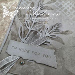
To add even more texture, I distressed the edges of the cardstock with my scissors before gently crinkling the panel. A little more Gray Granite ink brushed over the edges and creases helped highlight all of that wonderful texture. The delicate die-cut leaves, cut from Gray Granite cardstock, really stand out against the inked background without introducing another color.

I kept the sentiment monochromatic as well by stamping “I’m Here for You” in Gray Granite on a die-cut label. Finally, I finished the card with Gray Granite Variegated Ribbon and a few Mosaic Dots for just the right amount of sparkle and elegance.

This card was a wonderful reminder that sometimes limiting yourself creatively can actually open the door to new ideas. It’s amazing how much interest you can create with a single color by simply varying the depth of ink, layering textures, and adding dimension.

Have you ever challenged yourself to create a true monochromatic card using just one color? I’d love to hear which color you would choose or better yet share your creation in the comments or on my social media.

No matter where your creative journey takes you, I’m so glad you’re here. Let’s learn, create, connect, and grow together—one project at a time. 🦋

A beautifully crafted Christmas card featuring a window scene that displays a peaceful nativity setting on one side, while the inside is adorned with cozy holiday elements like hanging stockings and warm colors.

💕 Let’s Stay Connected

📺 YouTube 📘 Facebook 📸 Instagram 📌 Pinterest

Inspired by TGIF Challenges #TGIFC585

As I’ve been working behind the scenes updating my website, one of the pages I’ve been most excited to create is a new section dedicated to the creative challenges I love participating in. Challenges are one of my favorite ways to spark creativity, try new techniques, and look at my supplies in a whole new way.

While putting that page together, I came across the TGIF Challenges #TGIFC585 sketch and knew it would be the perfect inspiration for my next project.

For this card, I reached for the Splash and Relax Bundle to create a bright, cheerful summer design. The sketch immediately made me think of sunshine, water, and relaxing by the pool.

To create the background, I used the Water & Dotted Lines Mask with a blending brush, layering Pool Party, Coastal Cabana, and Pretty Peacock ink to build the water effect. Once the ink was blended, I added a simple splash of water across the background to lift some of the color and create natural texture. It’s one of my favorite techniques because it’s incredibly easy but gives such beautiful results.

One other little detail I love is the baker’s twine. Rather than searching for the perfect color, I started with the gray baker’s twine from the pack and used my blending brush with Pretty Peacock ink to color it. It’s such an easy technique that lets you customize your twine to match any project. Plus, it gives you even more ways to use all the colors included in a multicolor pack!

I finished the card with a bright life preserver, my custom-colored baker’s twine, a simple greeting, and a few embellishments to keep the focus on the fun background.

Sometimes the simplest designs become my favorites, and this one definitely makes me smile. Between the ink-blended background, the water splatter texture, and the colored baker’s twine, this card uses a few easy techniques that add lots of interest without adding much extra work.

If you’ve never tried a sketch challenge before, I encourage you to give one a try. They are a wonderful way to get inspired and stretch your creativity.

Challenge: #TGIFC585

Exciting Update

I had so much fun creating this card, and when I found out it was selected as this week’s #TGIFC585 Challenge Winner, I knew I had to make a quick reel sharing a few of the techniques I used!

From the ink-blended background and water splatter texture to coloring the gray baker’s twine with Pretty Peacock ink, this card is full of simple techniques that make a big impact.

A huge thank you to the TGIF Challenges team for choosing my card! I’m honored that you loved it as much as I loved creating it. ❤️

Ready to make your own? For a complete supply list and quick access to all the products used, click here to shop this project.

Love creative challenges or looking for a little inspiration? Be sure to check out the Creative Challenges page in the Learn section of my blog. It’s packed with links to some of my favorite challenge sites, along with ideas to spark your creativity. They’re fun, inspiring, and a wonderful way to get yourself creating today!

Happy Stampin’

A beautifully crafted Christmas card featuring a window scene that displays a peaceful nativity setting on one side, while the inside is adorned with cozy holiday elements like hanging stockings and warm colors.

💕 Let’s Stay Connected

📺 YouTube 📘 Facebook 📸 Instagram 📌 Pinterest

Soft Florals & Bold Color: A #GDP533 Challenge Card

This week we’re jumping into another color challenge for the Global Design Project challenge #GDP533, featuring Strawberry Slush, Petal Pink, and Pretty Peacock. When I look at these colors together, I love them—they’re soft, fresh, and so pretty. But if I’m being completely honest, once I sat down to actually create with them… I struggled more than I expected.

Perfect timing though, because my most recent Stampin’ Up! order arrived, and inside was the Lovely Florals Stamp Set #166797, which has been sitting on my wish list for quite a while. I was a little sad to realize it’s now on the Last Chance list (along with the Texture Notes Dies #165555), but it turned out to be exactly the inspiration I needed for this card.

I started by stamping the floral image in Black StazOn Ink #101406, then pulled out my Water Painters #168253. I dipped them directly into my ink pads and watercolor-painted the image, which allowed me to control the intensity of each color while still keeping that soft, artsy feel.

For the background, I stamped the grid image onto white cardstock and used my water painter to flick ink onto the paper, creating a fun speckled effect. I then went back in with a Blending Brush #160518 to add more color. This technique was such a win—I could leave some of the white showing and create multiple shades of color, essentially making my own custom DSP.

One of my favorite little tricks on this card came from a happy workaround. I wanted a square layer behind my focal image, but the dies I had were rectangular. Instead of cutting the full die, I partially ran it through the machine so it only cut part of the image. Then I lined it up and cut the opposite side. The result? A square cut with that same cool patterned edge—problem solved!

To finish things off, I added Adhesive-Backed Gems #165615 and Faux Linen Ribbon #165274 for a bit of texture and sparkle.

You’ll notice there’s no sentiment on this card—and yes, that was intentional. I originally planned to add a “hello,” but in the end I decided to leave it off. Sometimes it’s nice to have a card ready to go, so you can add the perfect sentiment when the moment calls for it.

Thanks so much for stopping by! Be sure to check out all the beautiful projects shared by the designers over at the Global Design Project—this color combo definitely sparked some gorgeous creativity this week. 💕


A beautifully crafted Christmas card featuring a window scene that displays a peaceful nativity setting on one side, while the inside is adorned with cozy holiday elements like hanging stockings and warm colors.

Please feel free to contact me if you have any questions.

Contact me today to place your order!
435-232-2655 Cell ( Call or Text)
andersoncandice@hotmail.com


💕 Let’s Stay Connected

📺 YouTube
📘 Facebook
📸 Instagram
📌 Pinterest

From Treat Bag to Box: My Favorite Heart Gusseted Treat Bag Project

Monday night on my live, I shared multiple projects using the Heart Gusseted Treat Bags (#167073), and I had so much fun playing with these bags and seeing just how many ideas I could come up with. 💕

My live video featured my favorite project.. This little box is relatively simple to make, and I love how versatile it is—plus, one bag makes TWO boxes, which is always a win!

Box Instructions

Start with one Heart Gusseted Treat Bag:

  1. Cut off the top folded portion of the bag.
    • Measure 9-1/4″ up from the bottom and cut.
  2. Trim the bottom so the bag measures 9″ total.
  3. Cut the bag in half at 4-1/2″.
  4. Score the bottom at 3/4″.
    • Be sure to flip the piece so you get a good score on both sides.
  5. Cut the corners on the bottom of each piece up to the 3/4″ score line.
    • You should now have two red sections and two white sections.

Box Base (for Support)

  • Cut a piece of chipboard to 4″ x 1-1/4″
    • I used chipboard from my Paper Pumpkin kits.
  • Cover with Real Red cardstock, also 4″ x 1-1/4″.
  • Adhere to the bottom of the inside of the box for extra stability.

Decorating Details

A close-up view of a decorative Valentine's Day card featuring layered hearts in shades of pink and red, with a ribbon that reads 'Hugs & Kisses'. The background includes a lace-like doily pattern.

Decorate your box as desired! For my sample, I used:

  • Lovely Doilies #167104
  • Endless Love Stamp Set #167055
  • Endless Love Dies #167061
  • Bubble Bath Ribbon #167075
  • Real Red Baker’s Twine #164051

Colors: Real Red, White, & Bubble Bath

Perfect Fit: This box fits our Note Cards (#159232) perfectly, making it ideal for a sweet Valentine note or gift enclosure.

The simple card design tucked inside the box was inspired by Heidi Collins, keeping the look clean, classic, and easy to recreate.

Bonus: This project is the perfect fit for this week’s Global Design Project challenge – Hearts #GDP531! 💖

Be sure to check out my video to see just how easy this project is to create, along with the other fun ideas I shared. I’ll be posting more details on the remaining projects later this week, so be sure to tune back in! 💕


A beautifully crafted Christmas card featuring a window scene that displays a peaceful nativity setting on one side, while the inside is adorned with cozy holiday elements like hanging stockings and warm colors.

Please feel free to contact me if you have any questions.

Contact me today to place your order!
435-232-2655 Cell ( Call or Text)
andersoncandice@hotmail.com


💕 Let’s Stay Connected

📺 YouTube
📘 Facebook
📸 Instagram
📌 Pinterest

Hello Sunshine & Travel Dreams ✈️🌞

Did you know that today is National Shop for Travel Day?
That feels perfectly timed because my future travel plans include a Caribbean cruise—and after almost two years of planning, I’m finally down to under 100 days! 🎉

With travel on the brain, it felt only right that during my live yesterday I featured the Beach Boardwalk Suite. This collection also has a coordinating scrapbooking kit, and I can hardly wait to use it to document our trip once we return. 🌊📸

For this project, I used the Global Design Project #GDP530 layout challenge as my starting point. I pushed myself a little out of my comfort zone and treated the layout more as inspiration rather than a strict roadmap—which is definitely not my norm!

Two colorful greeting cards featuring a beach scene with palm trees, a large sun, and the text 'HEY, SUNSHINE'. The background has soft pastel colors and textured layers.

Design Inspiration & Creative Changes

Logo of the Global Design Project featuring a globe icon with a heart, accompanied by the text 'GLOBAL DESIGN PROJECT' and the hashtag '#GDP530'. Below is a simple design with circular shapes in green and white, set against a light green background.

One of the main elements in the challenge layout is three circles on the side. Instead of circles, I swapped them out for three palm trees, keeping the visual balance while adding a fun tropical twist. 🌴🌴🌴

I also decided to turn this into a slimline card, which is one of my favorite formats. This size fits perfectly in a legal-size envelope, making it great for mailing or gifting.

Card Size & Base

While there are many slimline sizes, I typically make mine 8-1/2″ x 3-1/2″. I also love turning them into pocket cards for money or gift cards.

  • Card base: 8-1/2″ x 8-1/2″, scored at 3-1/2″ and 7″
  • Card base color: White

Background & Layers

I cut a second piece of white cardstock to 8-1/4″ x 3-1/4″ and used my blending brushes with Strawberry Slush, Petunia Pop, and Pool Party to create a soft ombre background.

For the square focal element, I cut a piece of Beach Boardwalk DSP #166820 using the largest square from the Stylish Shapes Dies #159183 and framed it with a 3″ x 3″ piece of cardstock:

  • Card 1 frame: Strawberry Slush
  • Card 2 frame: Petunia Pop

Want to see all the steps come together?
Be sure to check out the replay from my live, where I walk you through the entire process and share extra tips along the way. 🎥✨

Stamping & Die Cutting Details

Two hand-crafted greeting cards featuring a watercolor background with pink and blue tones, silhouettes of palm trees, and a yellow sun.
  • Palm trees stamped from Boardwalk Fun Stamp Set #166822 in Petunia Pop on the DSP
  • Additional palm trees die cut in black cardstock using Boardwalk Fun Dies #166828
  • I layered two of them over the stamped palm trees to create a shadow effect.

For the sun, I used one of the stitched circle dies (third smallest) cut from white cardstock and blended Daffodil Delight and Timid Tiger for added depth ☀️.

Sand, Waves & Finishing Touches

  • Sand: Torn Crumb Cake cardstock, stamped with dots from Swirled Designs #167030 in Pecan Pie, then softly blended for dimension
  • Waves: DSP cut with Light & Wonder Dies #165762, edges highlighted with Pool Party ink

I stamped “Hey, Sunshine” in black ink in the bottom right corner and wrapped Strawberry Slush Ribbon around the ombre background before assembling everything.

The palm trees were popped up with Stampin’ Dimensionals, and I finished them off with a simple knot secured using Mini Glue Dots. A few Strawberry Slush & Pretty in Pink Gems #165615 added just the right amount of sparkle ✨.

Inside Pocket

A colorful greeting card design featuring palm trees and a sun, with the text 'HEY, SUNSHINE'. The card is partially open, revealing a two-dollar bill inside.

On the inside, I added a strip of DSP to the top of the 1-1/2″ folded section and used Tear & Tape on the sides to create a pocket—perfect for cash or a gift card.

This bright, happy card has me so ready for warm weather and sunshine, especially while we’re still in the middle of winter ❄️➡️☀️.

💬 Tell me:
What trip are you dreaming of taking this year? And can you see yourself using the Beach Boardwalk Suite for your summer plans?

If so, be sure to add this amazing suite (and all the fun extras!) to your cart today. 🛒🌴
If you enjoyed this project, remember to click follow so you’ll be notified when I share more creative inspiration and upcoming projects.

Thanks so much for stopping by—I truly appreciate you! ☀️✨


A beautifully crafted Christmas card featuring a window scene that displays a peaceful nativity setting on one side, while the inside is adorned with cozy holiday elements like hanging stockings and warm colors.

Please feel free to contact me if you have any questions.

Contact me today to place your order!
435-232-2655 Cell ( Call or Text)
andersoncandice@hotmail.com


💕 Let’s Stay Connected

📺 YouTube
📘 Facebook
📸 Instagram
📌 Pinterest