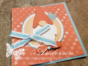
I mentioned a while ago that I have a Pinterest board that I often go to when I need some inspiration, especially for layout ideas. This time I gave myself the challenge to use the same layout and same designer series papers with three different stamp sets. The Designer series paper I chose to use is the Design a Daydream paper that is only available as a hostess item. I will say it’s one of my favorite set of papers. Just a reminder hostess items are only available if your order is over $150 or if you gather some friends together to place your orders together. I would be happy to help you get your own free items.
The point of this was to help you see that first I may use something as an inspiration, but I don’t always follow it exactly and second to help you see how you can take an idea and make it your own.
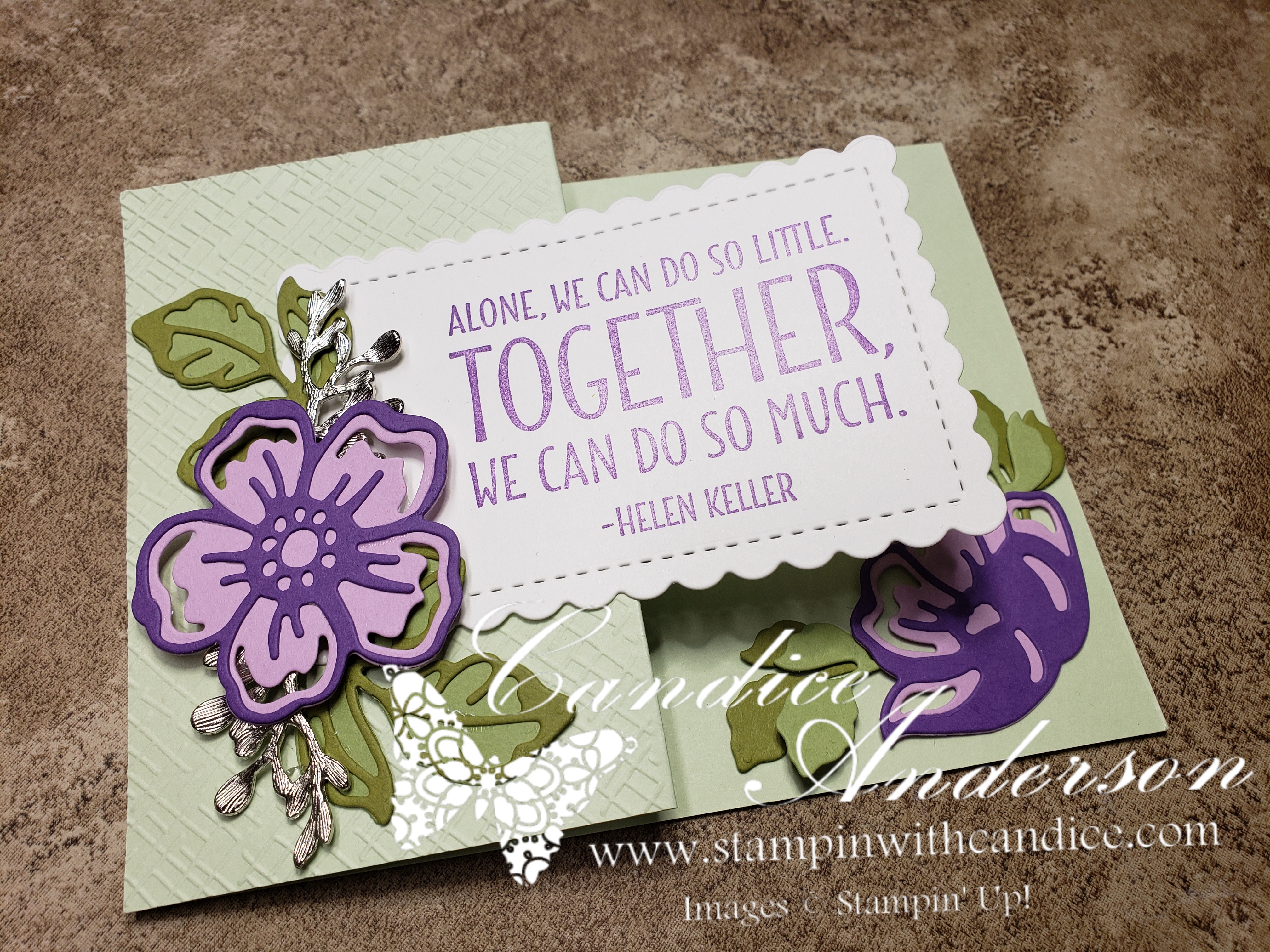
Beauty of Friendship


The first set I decided to start with was the beauty of friendship set. I’ve had this set since if first came out and have actually used it quite a bit. It was fun to pull it out and try something new with it. I even used another new in color, Coper Clay, for the base of the tree and the embossed background. For this card I used an embossed piece for the thinner section rather than designer series paper.
- 154983 – Beauty of Friendship Stamp Set (R)
- 159161 – Design a Daydream 12 x 12 hostess paper (R)
- 151326 – White 1/4″ Crinkled Seam binding Ribbon (R)
- 157627 – Gingham Embossing Folder (R)
- Colors – Old Olive (C), Copper Clay (N), Garden Green (C), Basic White (C)
(R) Retiring, (C) Carrying Over, (N) Found in the New 2023-2024 Catalog starting May 2, 2023
A Little Cheesy

This time I used two different designer series papers and layered the center image. I also changed the sizes just a bit. I was originally going to use the cookie images in the stamp set, but decided that the pudding one worked better with the DSP colors. The pudding image is stamped in blackberry bliss and then I used the blender pens to color it in. I had to be careful so I didn’t end up getting the blackberry color in the yellow pudding. Oh and by the way the yellow color is one of our new colors Lemon Lolly.
- 159131 – A little Cheesy Stamp Set (R)
- 148551 – Rectangle Stitched Framelits Dies (R)
- 159161 – Design a Daydream 12 x 12 hostess paper (R)
- 155475 – Baker’s Twine Essentials Pack, White (C)
- Colors – Blackberry Bliss (C), Petal Pink (C), Old Olive (C), Lemon Lolly (N)
(R) Retiring, (C) Carrying Over, (N) Found in the New 2023-2024 Catalog starting May 2, 2023
Lovely You

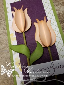
I decided to really go different with this one and create a slim line card. The size is 8 1/2 by 3 when folded. I got the idea for the 3D tulips from my friend Rose Coleman as she made a fun spring project with them. What’s cool is they are done in such a way that they can still flatten down for mailing (it will required hand stamped postage though.) They are easy to create simply by punching three tulips and then scoring them down the center and gluing the three sections together. I used directly to paper technique to add some color to them. I added dimension by using a bamboo stick for the stem and rolling it in the ink. Be sure to use a bone folder to add some depth and dimension to your leaves. I think someone would feel pretty special getting a card like this.
- 152525 – Lovely You Stamp Set (R)
- 151295 – Tulip Builder Punch (R)
- 152883 – Lovely Labels Pick a Punch (R)
- 159161 – Design a Daydream 12 x 12 hostess paper (R)
- 156505 – Timeworn Type 3D (C)
- Colors – Blackberry Bliss (C), Old Olive (C), Petal Pink (C), Basic White, (C)
(R) Retiring, (C) Carrying Over
Please feel free to contact me if you have any questions.

Order online
Click on the shop now button.
Contact me today to place your order
or book your party!
435-232-2655 Cell ( Call or Text)
andersoncandice@hotmail.com Please feel free to contact me if you have any questions.