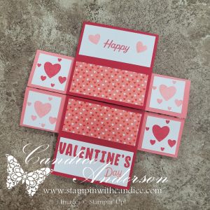
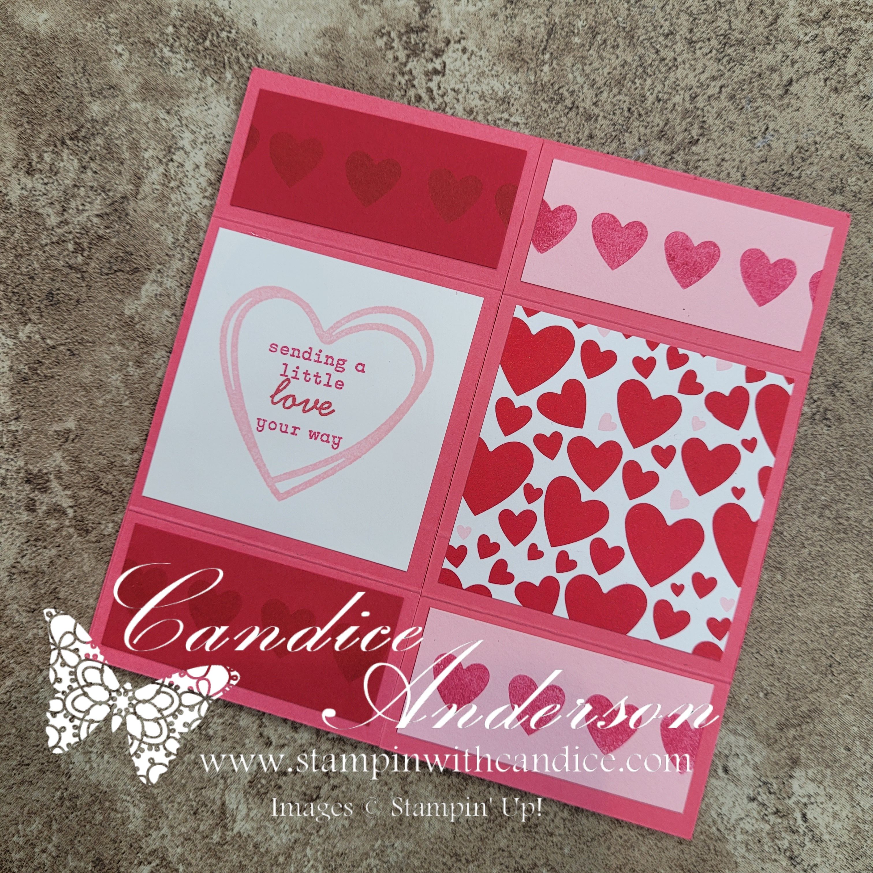
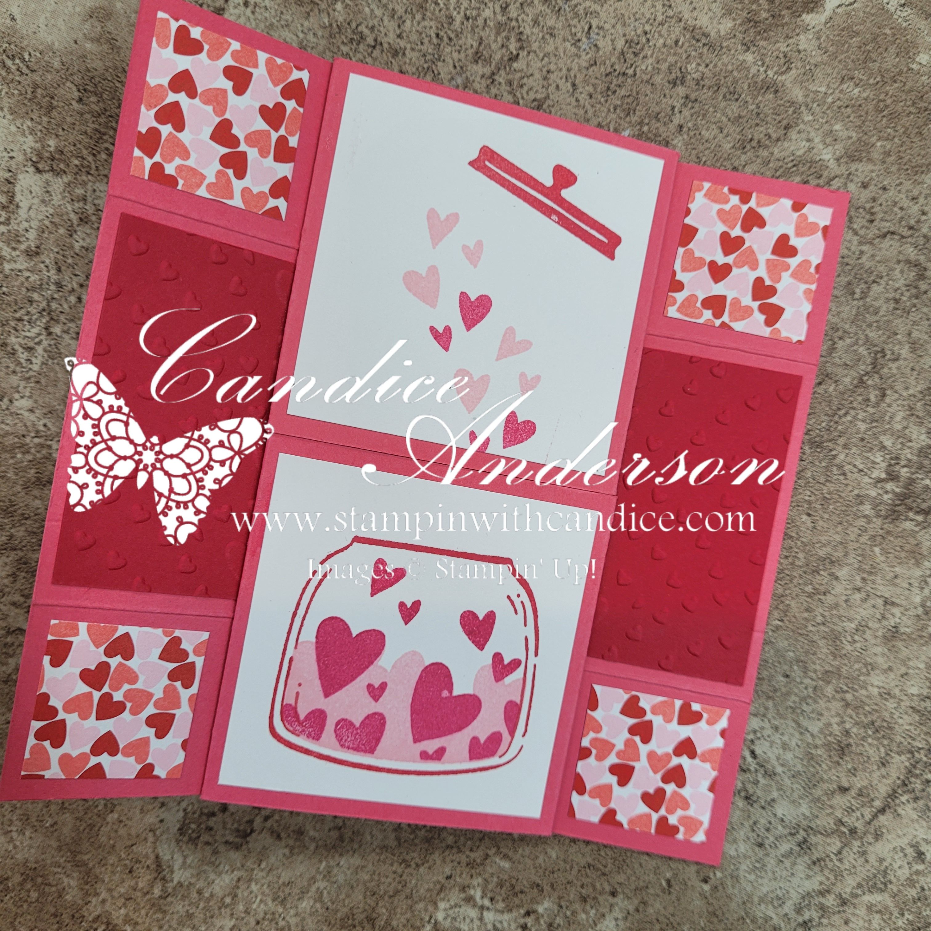
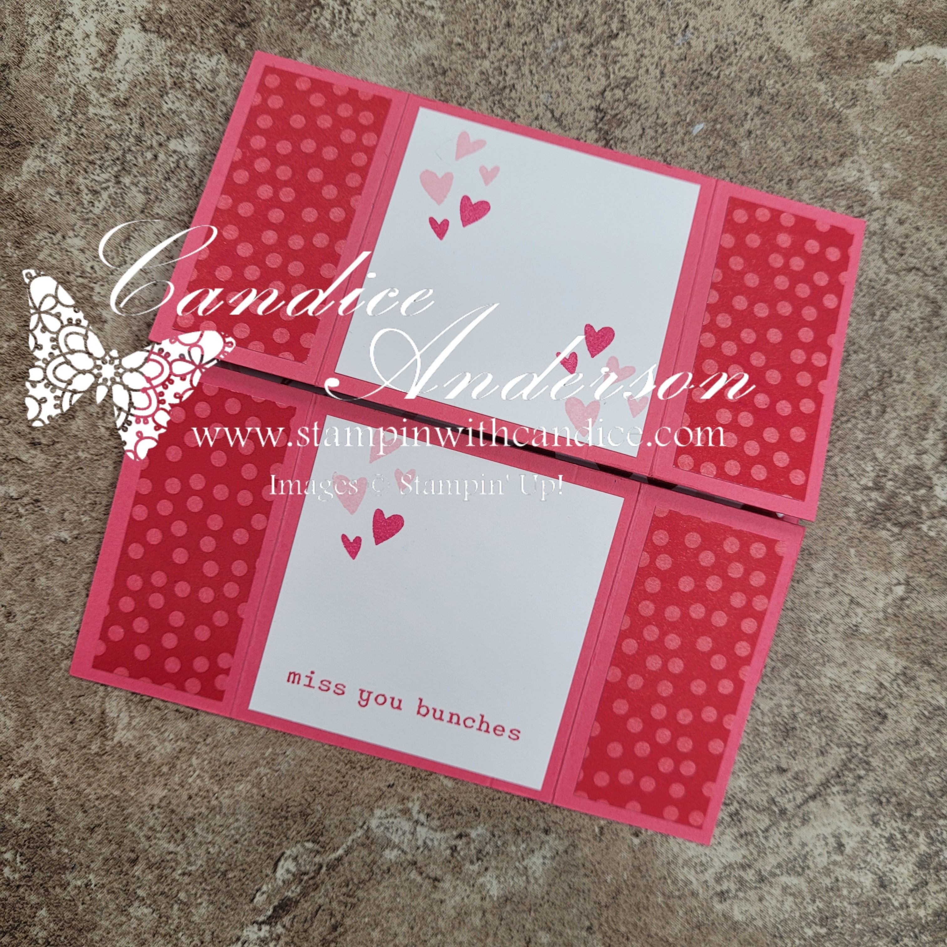
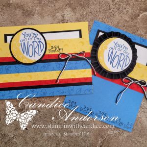
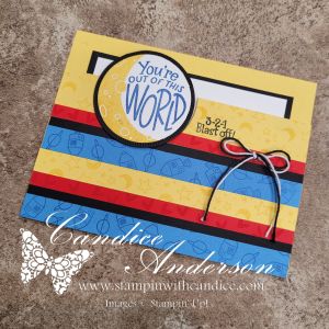
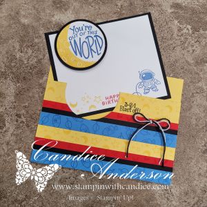
Last night on my live I shared this easy pocket fun fold card inspired by Sunny Day Stamping, and I promised you all the details! This card is so simple to create but still gives you that extra wow when the recipient pulls out the hidden insert.
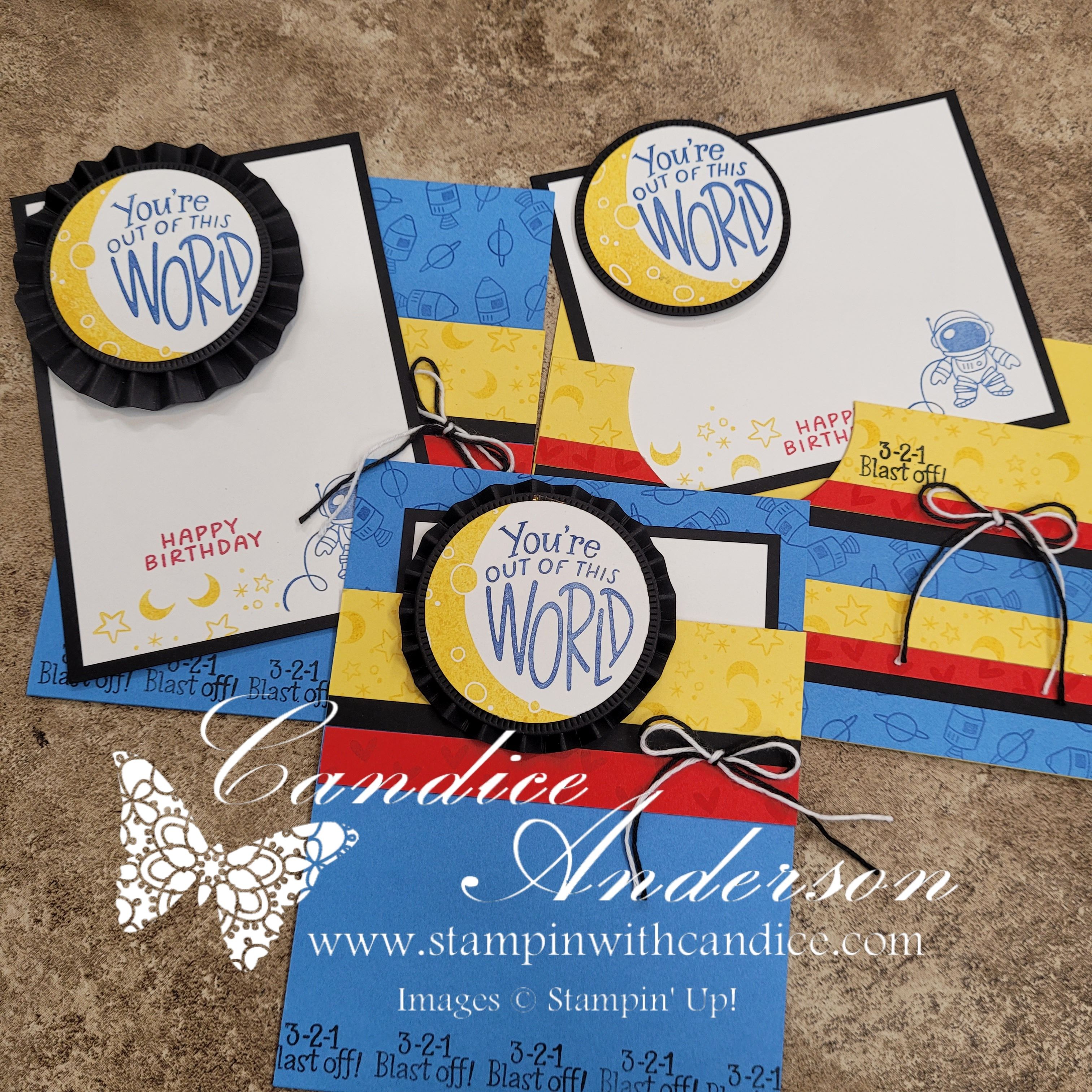
For my cards I used the brand new Moon and Back Stamp Set (#167531) coming in March — and it is absolutely adorable. 🌙 It pairs perfectly with this interactive design.
How to Create the Pocket Fun Fold
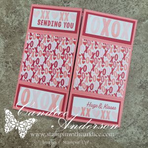
This design is very versatile. You can create it horizontal or vertical — I did one of each!
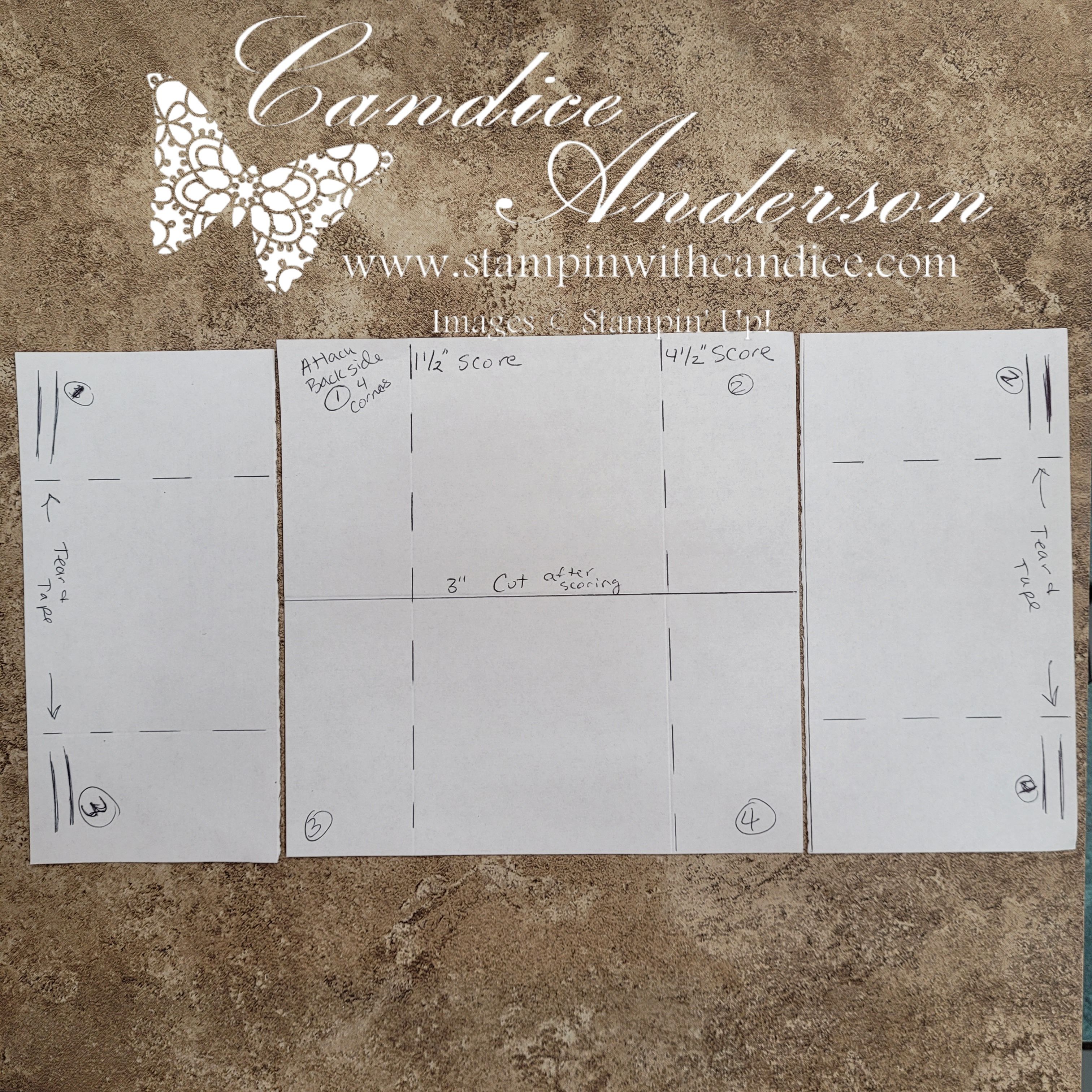
- Choose your direction (horizontal or vertical).
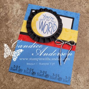
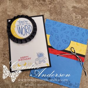
- Decide how much you want your pull-out insert to peek over the top. You can either fold it down or cut it off.
- I cut off 1″ on my horizontal card.
- I cut off 1-1/2″ on my vertical card.
- Use adhesive to seal the sides (I used Tear & Tape) or simply wrap a ribbon or belly band around the card.
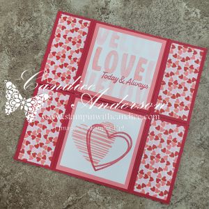
- Pick a circle shape for your focal point.
Now here’s the fun part 👇
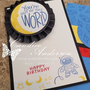
Before you fully close your pocket, punch or die cut a matching circle on the card base directly behind where your focal circle will sit. This allows your focal image to actually attach to the pull-out insert instead of the card front.
When attaching your focal circle to the pull-out piece, use Stampin’ Dimensionals so it sits slightly raised above the paper. This not only adds dimension and extra WOW, but it also makes the insert easier to slide in and out — and easier for the recipient to grab ahold of.
Such a simple trick — but it makes a big difference in both the design and functionality and t it creates that magical interactive element when the card is opened!
Adding Even More WOW
On my vertical card, I stepped it up by adding a handmade rosette behind the circle focal point. It adds dimension and really makes the design pop. This is quick any easy to do using the simply scored tool. I walk you through it in the video.
This fun fold truly is out of this world — and perfect for birthdays, kids’ cards, encouragement, and more.
Be sure to watch the replay for full step-by-step instructions and to see exactly how it all comes together!
Supplies Used
Stamps & Dies
- Moon and Back Stamp Set (#167531 – coming in March!)
- Spotlight on Nature Dies (#163580)
- Stylish Shapes Dies (#159183)
Tools & Accessories
- 2″ Circle Punch (#133782)
- Simply Scored (#122334)
- Tear & Tape Adhesive (#154031)
- Stampin’ Dimensionals (#14430)
- Black & White Baker’s Twine (#155475)
Cardstock
- Daffodil Delight
- Basic Black
- Poppy Parade
- Azure Afternoon
Ink
- Real Red
- Crushed Curry
- Blueberry Bushel
- Memento Black
If you give this pocket fun fold a try, I would love to see what you create! Be sure to tag me or share it in the comments. 💕
And remember to follow along so you never miss another Make It With Me Monday!
👉 You can shop current Stampin’ Up! supplies and tools here:
Shop with Me Here

Please feel free to contact me if you have any questions.
Contact me today to place your order!
435-232-2655 Cell ( Call or Text)
andersoncandice@hotmail.com