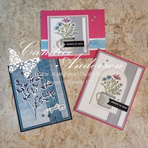
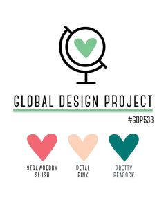
This week we’re jumping into another color challenge for the Global Design Project challenge #GDP533, featuring Strawberry Slush, Petal Pink, and Pretty Peacock. When I look at these colors together, I love them—they’re soft, fresh, and so pretty. But if I’m being completely honest, once I sat down to actually create with them… I struggled more than I expected.
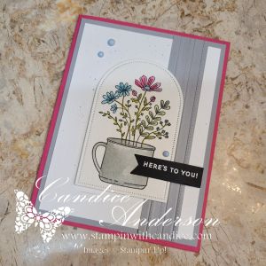
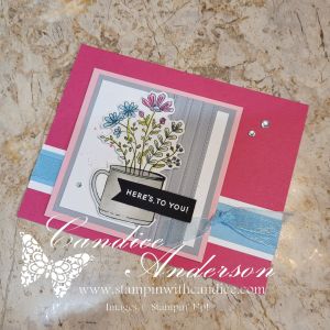
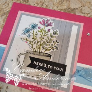
Perfect timing though, because my most recent Stampin’ Up! order arrived, and inside was the Lovely Florals Stamp Set #166797, which has been sitting on my wish list for quite a while. I was a little sad to realize it’s now on the Last Chance list (along with the Texture Notes Dies #165555), but it turned out to be exactly the inspiration I needed for this card.
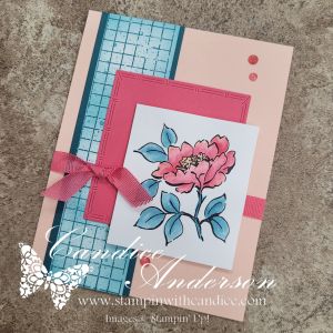
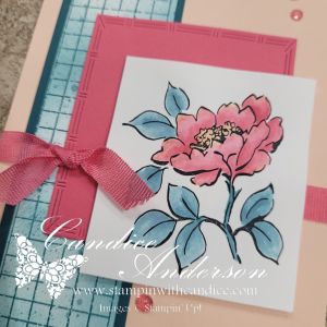
I started by stamping the floral image in Black StazOn Ink #101406, then pulled out my Water Painters #168253. I dipped them directly into my ink pads and watercolor-painted the image, which allowed me to control the intensity of each color while still keeping that soft, artsy feel.
For the background, I stamped the grid image onto white cardstock and used my water painter to flick ink onto the paper, creating a fun speckled effect. I then went back in with a Blending Brush #160518 to add more color. This technique was such a win—I could leave some of the white showing and create multiple shades of color, essentially making my own custom DSP.
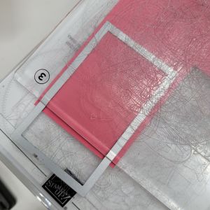
One of my favorite little tricks on this card came from a happy workaround. I wanted a square layer behind my focal image, but the dies I had were rectangular. Instead of cutting the full die, I partially ran it through the machine so it only cut part of the image. Then I lined it up and cut the opposite side. The result? A square cut with that same cool patterned edge—problem solved!
To finish things off, I added Adhesive-Backed Gems #165615 and Faux Linen Ribbon #165274 for a bit of texture and sparkle.
You’ll notice there’s no sentiment on this card—and yes, that was intentional. I originally planned to add a “hello,” but in the end I decided to leave it off. Sometimes it’s nice to have a card ready to go, so you can add the perfect sentiment when the moment calls for it.
Thanks so much for stopping by! Be sure to check out all the beautiful projects shared by the designers over at the Global Design Project—this color combo definitely sparked some gorgeous creativity this week. 💕
👉 You can shop current Stampin’ Up! supplies and tools here:
Shop with Me Here

Please feel free to contact me if you have any questions.
Contact me today to place your order!
435-232-2655 Cell ( Call or Text)
andersoncandice@hotmail.com