Finding Inspiration Through Casing a Designer | #GDP528

Casing Inspiration: Three Unique Card Designs
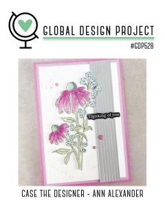
A card design featuring pink flowers and blue accents, with a stamped greeting saying 'Thinking of you,' framed by a gray vertical panel, and a pink border.

I don’t know about you, but inspiration is often one of the hardest parts of creating. Looking at what you have and figuring out how to turn it into something that not only speaks to you—but to others as well—can feel overwhelming at times. That’s where casing comes into play.

Casing (Copy And Share Everything) is one of my favorite ways to spark creativity. I often look to other designers when I need a jump-start, and the Global Design Project – Case the Designer challenges are a perfect source of inspiration.

This week we cased designer Ann Alexander, and during my live I shared how I pulled different elements from her card to inspire three very different designs of my own.


Card One – Same Layout, New Look

A handmade card featuring a botanical illustration of leaves in white on a textured blue background, with a greeting that says 'to a great guy'.

For my first card, I stayed fairly true to the original layout, but changed things up by using very different colors and imagery. I started with one of the new suites coming in January, Nature Walk (#166936), and used several elements from the suite including the stamp set, dies, Designer Series Paper, and embellishments.

To keep this card simple, I let the DSP do most of the work and added a stamped leaf image in Secret Sea along with a simple greeting. This is a great example of how keeping the layout but changing the products can completely transform a design.


Card Two – Color Combo with a Twist
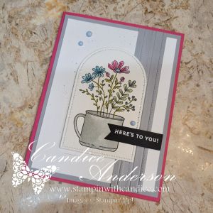
Card featuring a floral arrangement in a cup with a greeting that says 'HERE'S TO YOU!', set against a layered background of gray and pink.

For my second card, I wanted to focus more on the color inspiration while still using the basic design—this time with a bit of a twist. Because the floral image in Weekend Adventures (#167318) isn’t a large focal image like the cased card, I chose to frame it using the Everyday Arches Dies (#164629).

I stamped the image on Watercolor Paper (#149612) and colored it using Water Painters (#168253) with ink pads for a soft, blended look. The greeting was heat-embossed in white on black cardstock and punched out using the Banner Sayings Bundle (#167051).

To add texture, I used the Lovely Stripes 3D Embossing Folder (#167179 – coming in January) and kept the color palette clean and bold with Melon Mambo and Smoky Slate cardstock. I finished the card with Muted Palette Dots (#165155) for a subtle pop of detail.


Card Three – Smaller Scale, Same Inspiration

My final card is the one I demonstrated during the live. I kept the same core color palette from card two, but added Balmy Blue and Pretty in Pink cardstock for a softer feel.
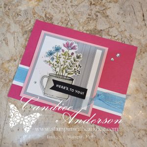
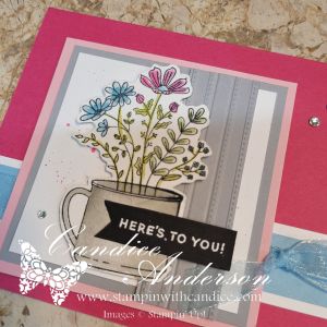
This time, I resized the layout to better fit the smaller image by cutting the design down and adjusting the focal point. I also flipped the card and went with a horizontal design rather than a vertical one. I layered Balmy Blue Sheer Ribbon (#165767) behind the image and finished the card with Rhinestone Basic Jewels for just the right amount of sparkle.


A Simple Splatter Technique (Used on All Three Cards)

Across all three cards, I used one of my favorite easy splatter techniques with ink pads and Water Painters. What I love about this method is how versatile it is—you can splatter in any color, make the drops big or small, and it won’t ruin your marker tips or waste ink.

Be sure to watch the video to see just how quick and easy this technique really is!


One Design, Endless Possibilities
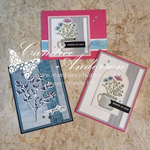
A display of three unique greeting cards featuring floral designs, each in different color schemes and layouts. The cards showcase a mix of elements such as stamped images, embellishments, and various backgrounds.

Seeing all three cards together really highlights why I love casing a designer so much. Even though each card was inspired by the same original design, they each have their own personality.

  • One focuses on layout with a fresh color palette
  • One leans into color inspiration with a bold, textured feel
  • And one adjusts the scale and proportions to better fit the image

By changing just a few key elements—colors, focal point size, textures, and embellishments—you can completely transform a design while still honoring the original inspiration.

The final result is three different and unique cards, all sparked by the same design. That’s the beauty of casing—it’s not about copying, it’s about letting someone else’s creativity jump-start your own.

So the next time you’re feeling stuck, take a look at the work of designers you admire and see what elements you can borrow to get your creativity flowing. Let their creativity spark your own. Remember—there’s no right or wrong way to case a card. The goal is simply to get those creative juices flowing and make it yours.


👉 You can shop current Stampin’ Up! supplies and tools here:
Shop with Me Here

A beautifully crafted Christmas card featuring a window scene that displays a peaceful nativity setting on one side, while the inside is adorned with cozy holiday elements like hanging stockings and warm colors.

Please feel free to contact me if you have any questions.

Contact me today to place your order!
435-232-2655 Cell ( Call or Text)
andersoncandice@hotmail.com

💕 Let’s Stay Connected

📺 YouTube
📘 Facebook
📸 Instagram
📌 Pinterest

#GDP527 – Reasons to Celebrate | Cheers & Sips Suite

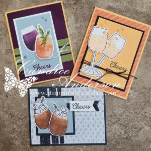
Three handmade greeting cards featuring drinks. The left card showcases a colorful cocktail with a pineapple garnish, the center card displays champagne flutes with bubbles, and the right card features glasses filled with a cold beverage and ice, all with the word 'Cheers'.

When I saw this week’s Global Design Project challenge, I knew the Cheers & Sips Suite was the perfect choice to grab. I had so much fun creating for multiple occasions—starting with some bubbly champagne, moving into a simple just because, and wrapping it up with cozy, seasonal hot chocolate.

Such a fun and versatile set! ✨
Heads up—this suite is on the Last Chance List, so be sure to grab it before it’s gone.

For each of my designs, I added a few elements outside of the Cheers & Sips Suite—things like ribbon, embellishments, and even other stamp sets. Can you spot what they were? 👀
Before I break down each card, let me first share what is included in the suite.


What’s in the Cheers & Sips Suite

Just a reminder: the stamps and dies are on the Last Chance List, but the designer paper is still available.

  • Cheers & Sips Stamp Set #165588 (Last Chance)
  • Cheers & Sips Dies #165593 (Last Chance)
  • Celebratory Sips Designer Series Paper #165586 (Still Available)

The bundle also includes: (not used on these projects)

  • Glass & Gardens Embossing Folders #165597 (Last Chance)
  • Gold Striped 3/8″ Mesh Ribbon #165599

A Fun Surprise! 🥳

I entered these cards into the Global Design Project challenge and had the best surprise on Monday when I was tagged and notified that one of my designs was chosen as this week’s winner! 🎉

Can you guess which one?
Here’s a hint… it’s the one where I got a little creative. 😉


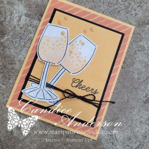
Card One – Bubbly with a Creative Twist 🥂

If you look closely at the Cheers & Sips stamp set, you’ll notice there is no stemmed wine or champagne glass. That didn’t stop me!

To create my glass:

  • I used the umbrella image as the base, masking off the top portion.
  • I masked the pin image to create two straight lines for the stem.

While the shape isn’t a perfect champagne flute, I still wanted that bubbly feel. To achieve that:

  • I used the Beautiful Butterflies Stamp Set #164608 (Last Chance) for the tiny dot images to mimic bubbles.

Additional details include:

  • Black Baker’s Twine #155475
  • 2024–2026 In Color Flat Pearls #165266
  • Lasting Linen Stamp Set #167107 for a subtle textured background
  • Wink of Stella #141897 for sparkle (because bubbly needs shimmer!)

I kept the color palette mostly tone-on-tone with a pop of black:

  • Petal Pink Stampin’ Blends #154893 for the champagne
  • Peach Pie cardstock and ink
  • DSP also includes Pumpkin Pie accents

Card Two – Let the DSP Shine ✂️

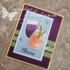
A handmade card featuring two stylized drink glasses, one purple and one orange, with a sprig of greenery, set against a textured, dark purple background and accented with a 'Cheers' message and ribbon.

For this card, I focused on using the suite itself and cut my images directly from the DSP instead of stamping.

The color combination came straight from the paper and was a little outside my comfort zone—but I loved how it turned out!

Details:

  • Peach Pie card base
  • Blackberry Bliss background embossed with the Exposed Brick 3D Embossing Folder #161600
  • Old Olive DSP for the striped background
  • White Baker’s Twine
  • Cloud Cover behind the glasses
  • 2025–2027 In Color Flat Pearls #165192

That brick texture adds just the right amount of interest without overpowering the design.


Card Three – Cozy Winter Vibes ☕

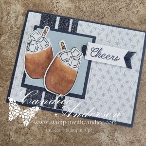
A handmade card featuring two drink images with ice, set against a patterned background, and the word 'Cheers' in stylish typography.

For my final card, I wanted a winter-inspired feel. The Cloud Cover DSP created the perfect backdrop.

I used a similar layout to Card Two but:

  • Flipped it horizontally
  • Varied the widths of the background strips
  • A smaller focal square for balance

Additional elements:

  • Peaceful Garden Glimmer Paper #165929 for sparkle
  • Secret Sea for the background and stamping
  • Neutral Stampin’ Blends for the drinks

Instead of stamping the ice cubes inside the drinks, I placed them on top. My goal was marshmallows with a touch of Wink of Stella—but my daughter said it looked more like iced coffee. ☕❄️
Honestly… either works!

Finishing touches:

  • Straw from the More Than Autumn Stamp Set #164228 (Last Chance)
  • More Than Autumn Dies #164075 (Last Chance)
  • Secret Sea Bordered Open Weave Ribbon #166932 (available in January)

One Suite – Three Very Different Cards

Three cards.
Three completely different looks.
One versatile suite.

That’s just one more reason to grab the Cheers & Sips Suite before it’s gone. If it’s been sitting on your wish list, this is your sign. 💛


👉 You can shop current Stampin’ Up! supplies and tools here:
Shop with Me Here

A beautifully crafted Christmas card featuring a window scene that displays a peaceful nativity setting on one side, while the inside is adorned with cozy holiday elements like hanging stockings and warm colors.

Please feel free to contact me if you have any questions.

Contact me today to place your order!
435-232-2655 Cell ( Call or Text)
andersoncandice@hotmail.com

💕 Let’s Stay Connected

📺 YouTube
📘 Facebook
📸 Instagram
📌 Pinterest


#StampinWithCandice #StamperCandi #GDP527 #GlobalDesignProject #CheersAndSips #StampinUp #HandmadeCards #LastChance

Day 1 – Creative Christmas Cards with Paper Pumpkin Kits

For Day 1 of my Christmas card challenges, I decided to reach for my Paper Pumpkin kit! I love how quick and easy these kits make it to get crafty — especially when time is short and creativity is flowing.

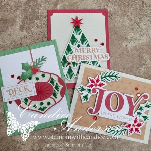
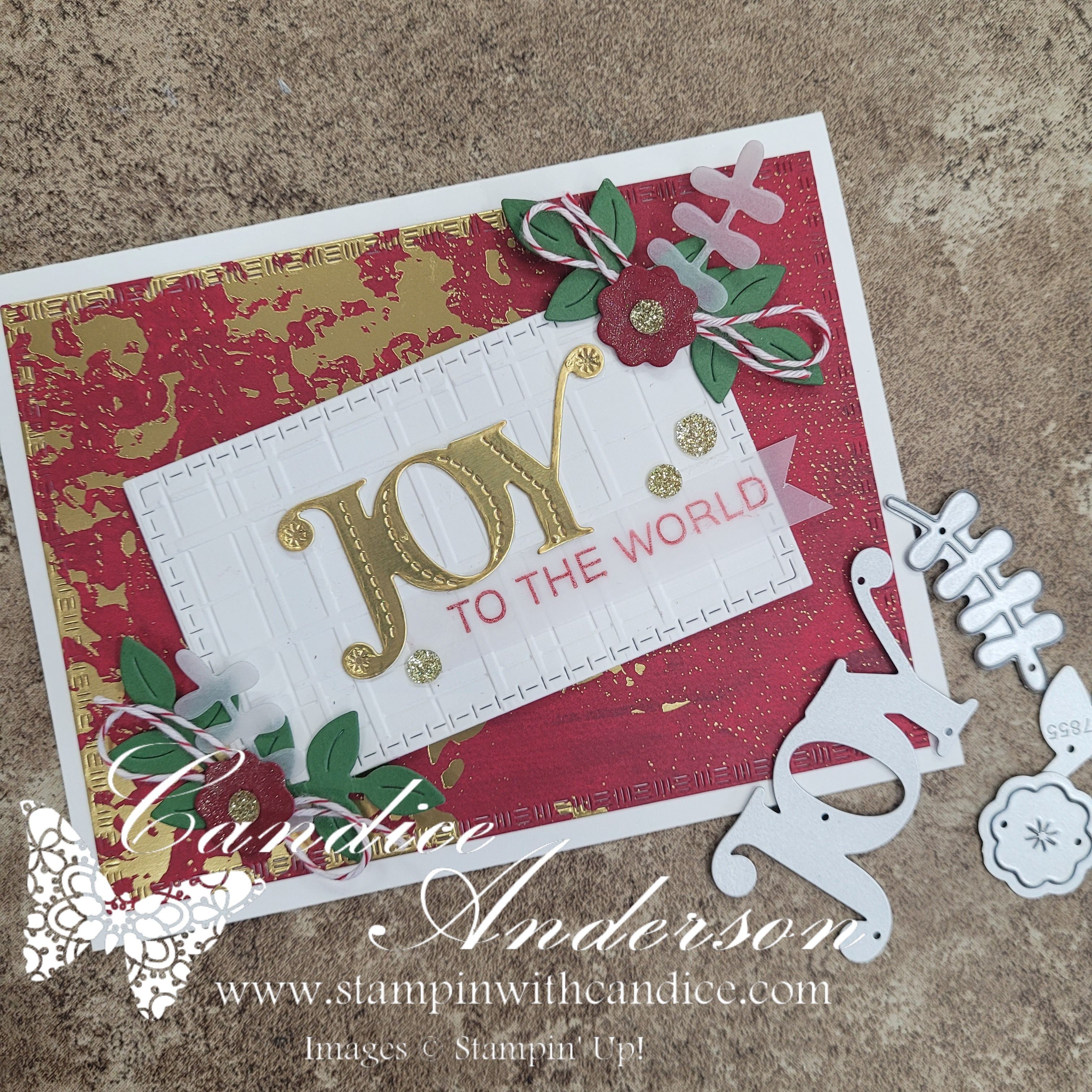
Three crafted Christmas cards featuring traditional holiday designs, including an ornament with 'Deck the Halls,' a card stating 'Merry Christmas,' and one proclaiming 'Joy to the World,' adorned with festive decorations in red and green.

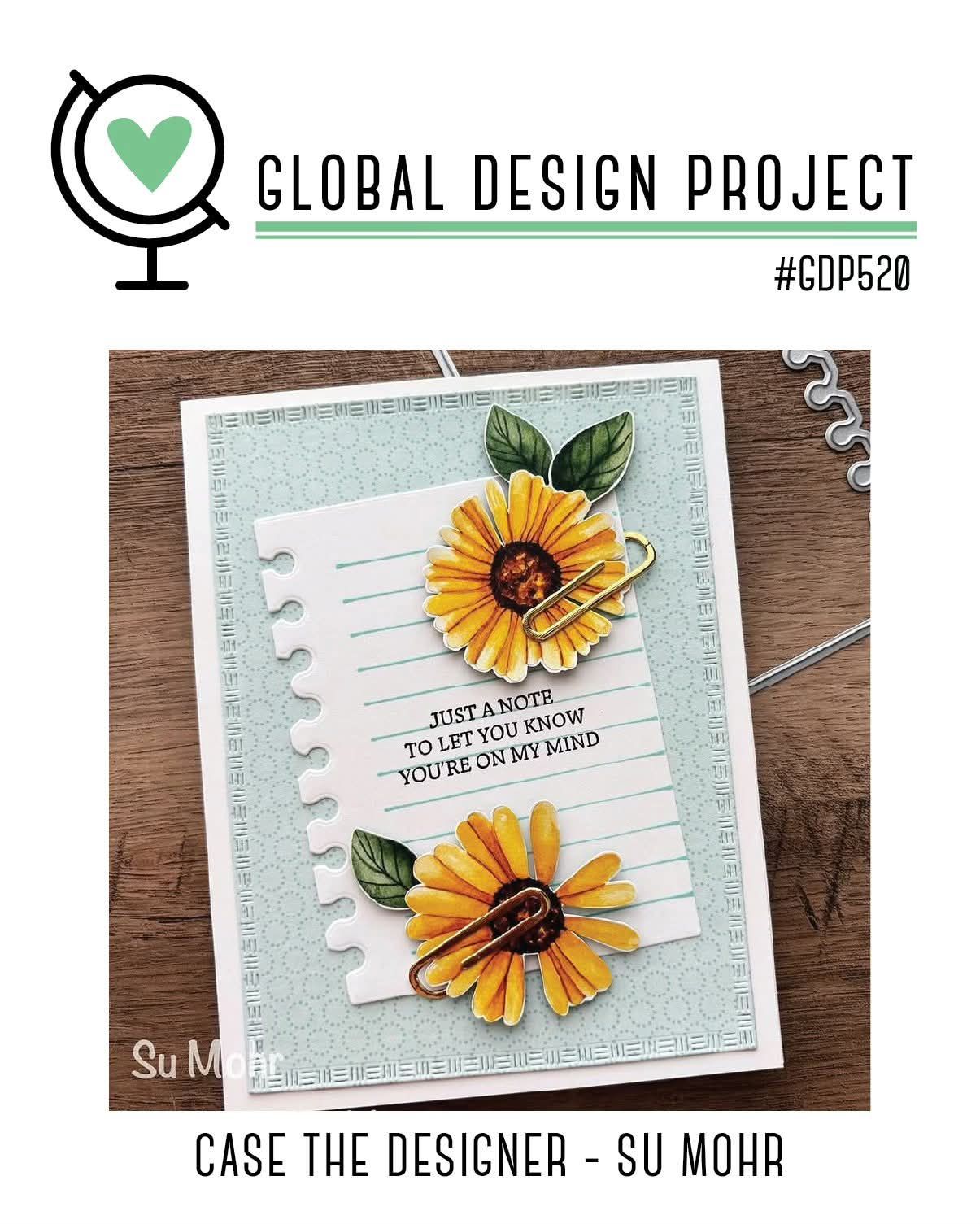
This month’s kit was the perfect way to jump into the holiday spirit with some traditional red and green cheer. I wanted to see if I could stretch the kit a little further, so I challenged myself to create one card that worked for both of my Christmas card challenges — plus fit the #GDP520 challenge, too!

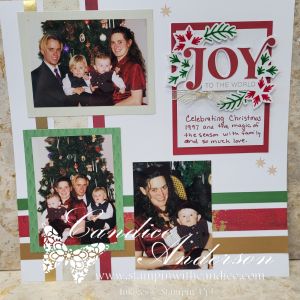
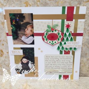
To round it out I couldn’t resist adding in a fun scrapbook layout using some of the leftover pieces, too!

Here’s what I took on today:
#ACardADayInNovemberDay 1: Traditional Red & Green Cheer
🎅 #30DayChristmasCardMakingChallengeDay 1: Merry and Bright Beginning
💚 #GDP520CASE the Designer: Sue Mohr

It’s amazing how versatile these Paper Pumpkin kits are — you can create cards, tags, gift packaging, or even add them into your memory-keeping projects. My scrapbook page features the same theme as my card — bright pops of red and green, festive accents, and a cozy, cheerful vibe.

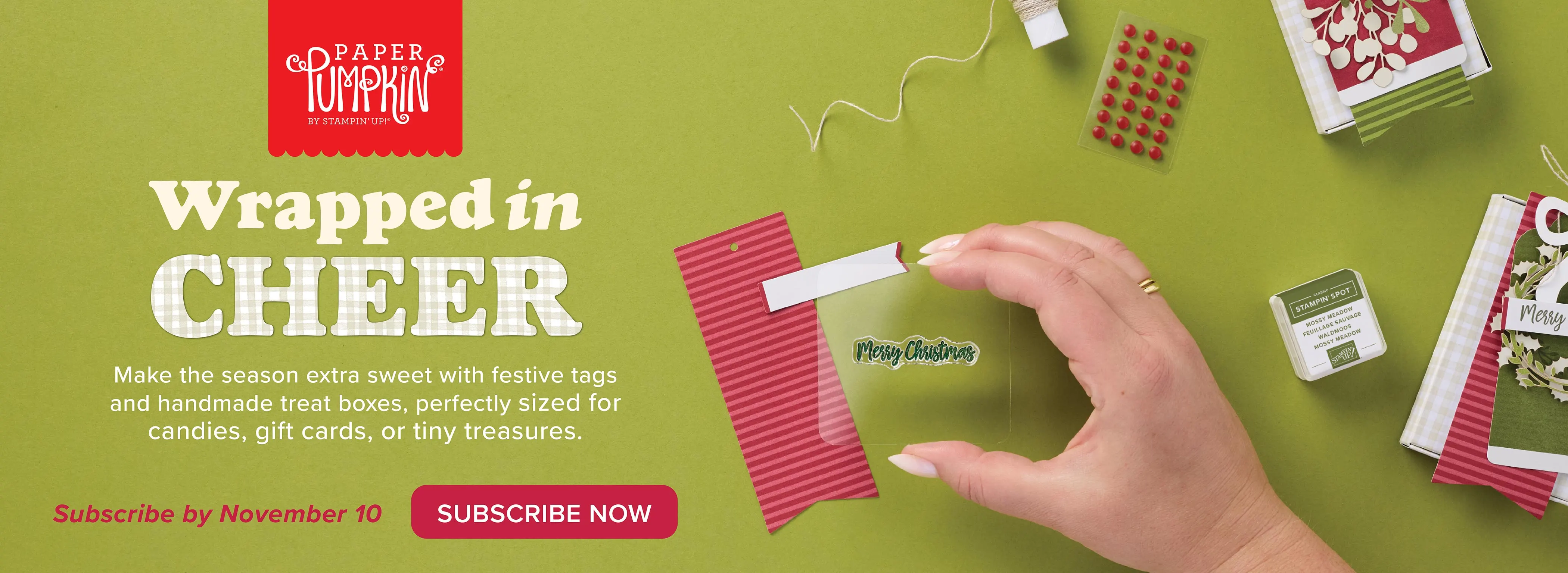
Paper Pumpkin is a monthly craft kit delivered to your door—perfect for quick, beautiful projects. Subscribe by the 10th to get next month’s kit

Promotional image for Paper Pumpkin kit featuring festive crafting supplies, including tags, treat boxes, and a Christmas stamp, all set against a green background.

If you haven’t opened your kit yet, this is your reminder: pull it out, play along, and see how far your creativity can go! ✂️✨

If you’d like to join in the fun and play along check out my Facebook group for links to both groups.
And Remember to share your own creations — I’d love to see how you use your Paper Pumpkin this season! 💌

This week’s project is my little tribute to a retiring favorite — the Beside Me stamp set. I used the #GDP490 layout as inspiration to create a heartfelt farewell card. Swipe to see how it turned out! #lastchancelist #stampinup #handmadecards

Please feel free to contact me if you have any questions.

Order online
Contact me today to place your order!
435-232-2655 Cell ( Call or Text)
andersoncandice@hotmail.com


💕 Let’s Stay Connected

📺 YouTube
📘 Facebook
📸 Instagram
📌 Pinterest

Spooky Fun with Global Design Project #GDP511

This week’s Global Design Project challenge was all about using letters or numbers in our creations, and I couldn’t resist having a little spooky fun! 👻

I decided to make a playful Halloween card with a hidden surprise inside. On the front, I kept it creepy-cute with a mummy-style design, complete with googly eyes peeking out and bold letters spelling “BOO.” The little spiders and ribbon detail added just the right finishing touches.

But the real magic happens when you open the card! Inside, a bright and cheerful monster pops up, showing off big eyes, sharp (but friendly) teeth, and a touch of candy corn for good measure. It’s such a fun way to combine the challenge theme with a seasonal project.

That’s what I love about these challenges—they push me to think outside the box and come up with designs I might not have tried otherwise.

Here’s a closer look at the details:

  • Front of the card: spooky letters + mummy bandages + spiders
    • #166191 Spooky Sweet 12 x12 Specialty Designer Series Paper
    • #166106 Fright Night Dies
    • #166103 Fright Night Stamp Set
    • #166203 Petunia Pop Iridescent Ribbon
    • #166202 Shimmer Star Foam Stickers
  • Inside: colorful monster made with die cuts and stamped background
    • #164629 Everyday Arches dies (face)
    • #166115 Tractor & Co Dies (hair)
    • #166191 Spooky Sweet 12 x12 Specialty Designer Series Paper (cutouts for nose and mouth)
    • #166106 Fright Night Dies (spider)
    • #159183 Stylish Shapes Dies (eye – inside)
    • #163580 Spotlight on Nature (eye – outside)
    • #162722 Trusty Tools (eye – center)
    • #166793 Sweet Halloween Stamp set (coming Sept 20205)
  • Theme tie-in: letters used both in the “BOO” and background sentiment
    • Colors used:
      • Basic black
      • Daffodil Delight
      • Granny Apple Green
      • Petunia Pop
      • Pumpkin Pie
      • Early Espresso
      • Pecan Pie
      • Crumb Cake
      • Very Vanilla

👉 Want to make your own spooky creations? You can order the products I used at www.candiceanderson.stampinup.net.

I had so much fun with this one, and I hope it inspires you to try a Halloween-themed card of your own! 🎃🕷️

If you’d like to join in on this week’s challenge, head over to the Global Design Project and play along with #GDP511.

Please feel free to contact me if you have any questions.

This week’s project is my little tribute to a retiring favorite — the Beside Me stamp set. I used the #GDP490 layout as inspiration to create a heartfelt farewell card. Swipe to see how it turned out! #lastchancelist #stampinup #handmadecards

Order online
Contact me today to place your order!
435-232-2655 Cell ( Call or Text)
andersoncandice@hotmail.com