Today’s Christmas Challenge brought two themes that couldn’t be more different: Hope and Light and North Pole Workshop. Instead of trying to force both themes into one design, I decided to lean into the contrast and create two separate cards—each with its own mood and message, but both built using the same layout and the same product focus:
Watercolor Pencils (#161700 & #149014) paired with Water Painters (#168234).
This turned out to be such a fun creative experiment—one layout, two techniques, and two completely different looks!
The Shared Layout
To keep a unified feel between the two designs, I started with a simple, versatile layout:
- Horizontal card base: 8-1/2″ x 5-1/2″, scored at 4-1/4
- Accent strip behind the focal point: 1-3/4″ x 5-1/2″
- Focal image panel: Die-cut using the Textured Notes Dies (#165555) — a perfect little frame for any image
- Layered background: 4-1/2″ x 4-1/4″ with the sentiment stamped along the bottom
It’s an easy formula that works for just about any stamp set or technique, which made it perfect for today’s theme split.
⭐ Card 1: North Pole Workshop
For my first card, I reached for a fun retired favorite—Christmas Crowd. It’s full of cheerful, whimsical North Pole characters, and it was the perfect set for a bright, playful look.
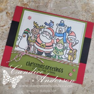

Technique: Coloring In the Image
For this card, I used the watercolor pencils in the most traditional way—coloring the entire image before blending it out slightly with my Water Painter. This gave everything a soft yet vibrant finish without overwhelming the line art.
Finishing Touches:
- Cherry Cobbler Baker’s Twine (#164051)
- Real Red & White Peppermint Embellishments (#164050)
These little elements really pull together that Santa’s-workshop, peppermint-candy vibe.
⭐ Card 2: Hope & Light (Silent Night Style)
For the second theme, I chose the retired Come to Bethlehem (#120591) set—a beautiful, solid-image stamp that has always felt powerful and peaceful to me.


Technique: Background Shading with Watercolor Pencils
Since the main image is a silhouette, I used the watercolor pencils differently for this card. Instead of coloring in the image, I lightly shaded a glowing backdrop behind the figures. With a soft wash from the Water Painter, it created a beautiful halo of color that makes the silhouette pop.
Finishing Touches:
- Black Baker’s Twine (#155475)
- Rhinestone Basic Jewels (#144220)
A little sparkle keeps the “light” theme present while keeping the card simple and serene.
⭐ The Result: One Layout, Two Techniques, Two Totally Different Looks
It always amazes me how using the same basic card design can produce completely different moods depending on the stamp set, colors, and technique.
- North Pole Workshop → bright, fun, colorful
- Hope & Light → soft, meaningful, peaceful
Both simple.
Both beautiful.
And both incredibly easy to create with supplies you already have.
👉 You can shop current Stampin’ Up! supplies and tools here:
Shop with Me Here

Please feel free to contact me if you have any questions.
Contact me today to place your order!
435-232-2655 Cell ( Call or Text)
andersoncandice@hotmail.com
💕 Let’s Stay Connected
📺 YouTube
📘 Facebook
📸 Instagram
📌 Pinterest
#StampinWithCandice #StamperCandi #ACardADayInNovember2025 #30DayChristmasCardMakingChallenge #ChristmasCards #HandmadeCards #CreativeTechniques #HolidayCrafting #cardmaker #cardmaking #christmascards #handmadecards #papercraft #sketchchallenge #christmaschallenge