Casing Inspiration: Three Unique Card Designs
I don’t know about you, but inspiration is often one of the hardest parts of creating. Looking at what you have and figuring out how to turn it into something that not only speaks to you—but to others as well—can feel overwhelming at times. That’s where casing comes into play.
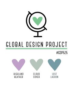
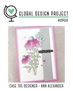
Casing (Copy And Share Everything) is one of my favorite ways to spark creativity. I often look to other designers when I need a jump-start, and the Global Design Project – Case the Designer challenges are a perfect source of inspiration.
This week we cased designer Ann Alexander, and during my live I shared how I pulled different elements from her card to inspire three very different designs of my own.
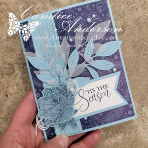
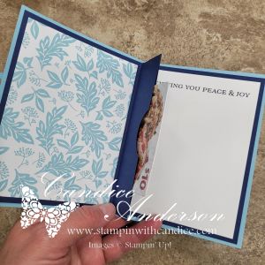
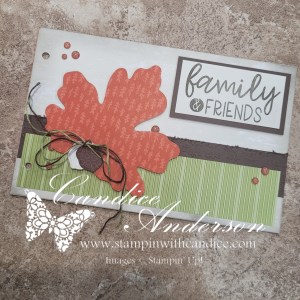
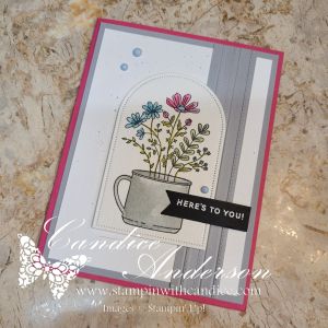
Card One – Same Layout, New Look

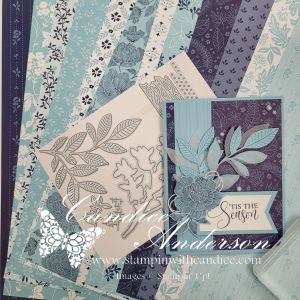
For my first card, I stayed fairly true to the original layout, but changed things up by using very different colors and imagery. I started with one of the new suites coming in January, Nature Walk (#166936), and used several elements from the suite including the stamp set, dies, Designer Series Paper, and embellishments.
To keep this card simple, I let the DSP do most of the work and added a stamped leaf image in Secret Sea along with a simple greeting. This is a great example of how keeping the layout but changing the products can completely transform a design.
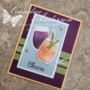
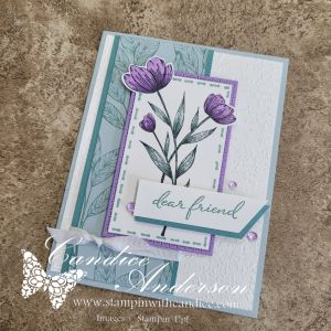
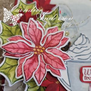
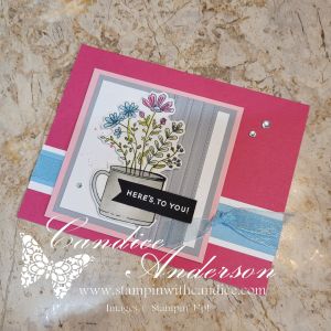
Card Two – Color Combo with a Twist
For my second card, I wanted to focus more on the color inspiration while still using the basic design—this time with a bit of a twist. Because the floral image in Weekend Adventures (#167318) isn’t a large focal image like the cased card, I chose to frame it using the Everyday Arches Dies (#164629).
I stamped the image on Watercolor Paper (#149612) and colored it using Water Painters (#168253) with ink pads for a soft, blended look. The greeting was heat-embossed in white on black cardstock and punched out using the Banner Sayings Bundle (#167051).
To add texture, I used the Lovely Stripes 3D Embossing Folder (#167179 – coming in January) and kept the color palette clean and bold with Melon Mambo and Smoky Slate cardstock. I finished the card with Muted Palette Dots (#165155) for a subtle pop of detail.
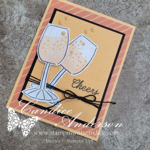
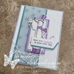
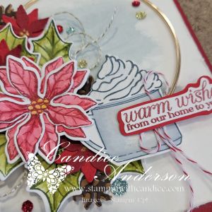
Card Three – Smaller Scale, Same Inspiration
My final card is the one I demonstrated during the live. I kept the same core color palette from card two, but added Balmy Blue and Pretty in Pink cardstock for a softer feel.
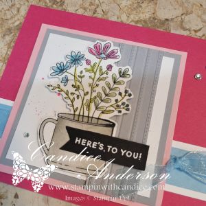
This time, I resized the layout to better fit the smaller image by cutting the design down and adjusting the focal point. I also flipped the card and went with a horizontal design rather than a vertical one. I layered Balmy Blue Sheer Ribbon (#165767) behind the image and finished the card with Rhinestone Basic Jewels for just the right amount of sparkle.
A Simple Splatter Technique (Used on All Three Cards)
Across all three cards, I used one of my favorite easy splatter techniques with ink pads and Water Painters. What I love about this method is how versatile it is—you can splatter in any color, make the drops big or small, and it won’t ruin your marker tips or waste ink.
Be sure to watch the video to see just how quick and easy this technique really is!
One Design, Endless Possibilities
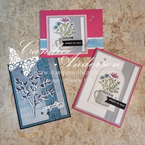
Seeing all three cards together really highlights why I love casing a designer so much. Even though each card was inspired by the same original design, they each have their own personality.
- One focuses on layout with a fresh color palette
- One leans into color inspiration with a bold, textured feel
- And one adjusts the scale and proportions to better fit the image
By changing just a few key elements—colors, focal point size, textures, and embellishments—you can completely transform a design while still honoring the original inspiration.
The final result is three different and unique cards, all sparked by the same design. That’s the beauty of casing—it’s not about copying, it’s about letting someone else’s creativity jump-start your own.
So the next time you’re feeling stuck, take a look at the work of designers you admire and see what elements you can borrow to get your creativity flowing. Let their creativity spark your own. Remember—there’s no right or wrong way to case a card. The goal is simply to get those creative juices flowing and make it yours.
👉 You can shop current Stampin’ Up! supplies and tools here:
Shop with Me Here

Please feel free to contact me if you have any questions.
Contact me today to place your order!
435-232-2655 Cell ( Call or Text)
andersoncandice@hotmail.com